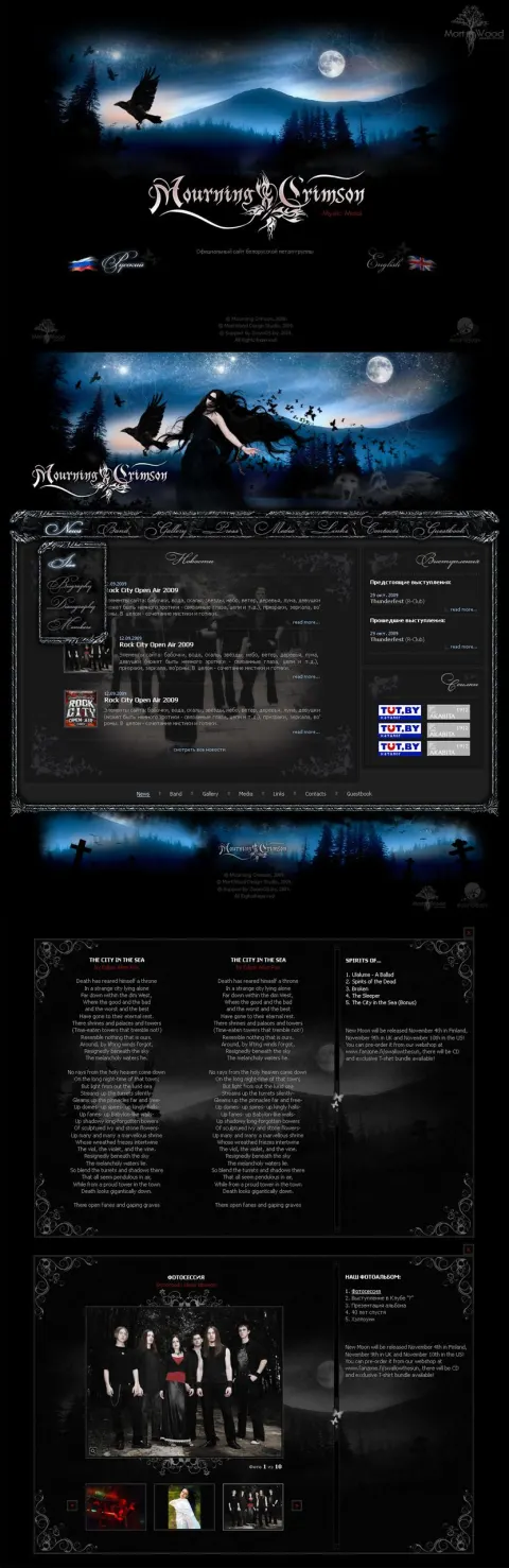
Gothic website design for the band Mourning Srimson
Type of work: Creating the website design for the band Mourning Srimson
A very large and extensive piece of work. The main difficulty was to fit gothic attributes such as crosses and a graveyard organically and beautifully into the design. Despite these attributes, the site turned out rather attractive.
Mourning Srimson is an alternative band, and its website had to be as uncompromising as its music. For bands of this genre a website is part of the artistic image, not just a place for news and concert dates: fans expect to step into the same dark, atmospheric world that they hear in the songs, and a neutral, template-like site would feel like a betrayal of that world.
It was a very large and extensive piece of work. The main difficulty was to fit gothic attributes - crosses, a graveyard and other symbols of the style - into the design organically and beautifully. Such elements are easy to overdo, and then a site turns into a heavy, gloomy collage that is hard to read and unpleasant to use. Our task was to let them create the atmosphere while keeping the site readable and convenient: deep blacks and dark tones for the background, carefully placed gothic details that frame the content rather than bury it, and clear navigation to the sections fans actually use - music, news, concerts, photos and contacts. Despite all these dark attributes, the site turned out rather attractive, and that balance was exactly the goal.
The search phrases the site was built around - gothic, gothic style, music, band, Mourning Srimson, gothic design, black in design - show that the site speaks both to the band's fans and to people interested in the gothic aesthetic itself, and the design was made to satisfy both.