

PurpleLabs creates handcrafted
designs and automated bots
for startups, fintech and IT companies

Creative Timeline
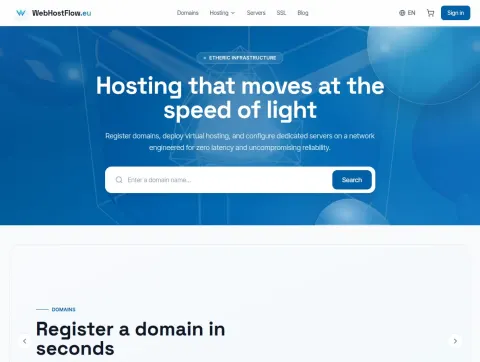
WebHostFlow.eu - EU web hosting, domains and VPS servers
Website: https://webhostflow.eu
Type of work: Design development, layout, web application development
Development of a unique design and a web application for a European hosting provider. The site brings together domain registration across 500+ extensions with instant availability search, shared hosting, virtual and dedicated servers, SSL certificates and business email - each with its own page and transparent prices in euros.
An interactive configurator picks a server by type, monthly budget and purpose, from a small VPS to enterprise and AI / ML machines. The project also includes a shopping cart, a customer account, a blog with guides from the infrastructure team, cookie consent management under the GDPR and an interface in six languages: English, German, Polish, Russian, Ukrainian and Belarusian.
The home page opens with the promise "Hosting that moves at the speed of light" and a domain search field, so a visitor can check a name before reading anything else. Below it, short blocks explain the three things buyers of hosting compare first: NVMe storage on every plan, the 99.98% uptime guarantee and prices shown in euros without hidden extras. The "Why choose WebHostFlow" section adds the arguments for a European audience - a low-latency network, round-the-clock support from people rather than bots, instant scaling and data that stays inside the EU.
The blog was planned as part of the product, not as decoration: articles on speeding up WordPress, moving a site to a new host without downtime and building a backup strategy answer the questions customers ask before they switch provider.
The server configurator replaced a long comparison table: instead of reading dozens of rows, the visitor answers three questions and gets a short list of suitable machines with monthly prices.
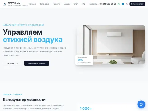
Vozduhan - sale and installation of air conditioners in Minsk
Website: https://vozduhan.minsk.by
Type of work: Design development, layout, CMS integration
Website development, creation of a unique design and CMS integration for Vozduhan, a Minsk company that sells climate equipment and installs it turnkey: wall-mounted, cassette, floor-ceiling, multi-split and mobile air conditioners from Daikin, Mitsubishi Electric, Panasonic, LG, Samsung, Haier, Gree, Midea and other brands.
The site has a catalog with filters by type and brand and model cards with capacity, recommended area, noise level and energy class, a cooling capacity calculator based on room area, a price list for installation, service and dismantling, sections with projects, promotions, a blog and FAQ, a request form, an online chat and quick contact via WhatsApp, Telegram and Viber.
The main message of the home page is short and practical: a three-year warranty and installation in one day. Popular models and a catalog by brand sit right under it, so a buyer who already knows the brand they want gets to it in one click, while someone who is still choosing can start from the type of unit.
A separate FAQ block answers the questions that usually come up on the phone: how to choose the capacity for a room, how an inverter air conditioner differs from a conventional one, which brand to pick and whether a model with heating is worth it. A step-by-step "How to order" section and a contacts block with working hours close the page, so the path from the first question to a booked installation fits on one screen.
The capacity calculator works the other way round from the catalog: the buyer enters the area of the room and immediately sees which models are suitable.
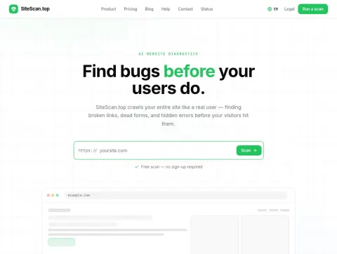
SiteScan.top - AI website diagnostics and automated site audit
Website: https://sitescan.top
Type of work: Design development, layout, web application development
Development of a unique design and a web application for a website diagnostics service. A headless browser opens every page the way a visitor does - it executes JavaScript and waits for network idle - while AI agents fill in and submit forms, so the audit catches broken validation and submission errors that a static scan never sees.
One report brings together nine analyzers at once: SEO, accessibility against WCAG 2.1, Core Web Vitals performance, security headers, HTML validity, forms, links, console errors and server infrastructure - with an overall score, issues sorted by priority, reproduction steps and PDF export. The first scan is free and needs no sign-up, further audits are paid for with credit packs that never expire, and the interface works in English, German, Polish and Russian.
The interface is built around a single action. The home page promises "Three steps. Under 60 seconds." and shows exactly those steps - paste your URL, let the AI do the work, get your report - next to a feed of recently scanned sites that shows the service is in active use.
For the report we designed a layout that works for both a developer and a site owner: the overall score and the most critical problems come first, the details for each analyzer follow, and every issue carries steps to reproduce it, so the report can be handed straight to whoever is going to fix it.
The pricing is equally simple: the first scan is free and needs no account, and further audits are paid with credit packs that never expire.
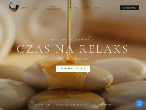
Czas na Relaks - website of a massage studio in Wrocław
Website: https://czasnarelakswro.pl
Type of work: Design development, layout, CMS integration
Website development, creation of a unique design and integration into the CMS for Czas na Relaks, an intimate massage studio on ul. Stawowa in the centre of Wrocław.
The site lays out the full menu of rituals - face massages (Kobido, Asahi, buccal, Gua Sha), body massages, Lomi-Lomi and hot stones, energy practices and care treatments - with prices, promotions and session packages, and adds gift vouchers, relaxation workshops and events, client reviews, a gallery, a blog and online booking. The interface is available in Polish and Russian.
A massage studio sells a feeling before it sells a service, so every ritual is presented through what it gives and how long it takes rather than through a list of techniques. Each treatment has its own card with the price and duration, so a client can compare, for example, Kobido and Gua Sha without opening several pages, and session packages show the saving next to the single price.
Booking is available from every service card, and gift vouchers have a separate entry point - for many visitors the first visit to the studio is a present from someone else. The address on ul. Stawowa 2a, the map and the opening hours are repeated in the footer, because people often look for them on the way to the studio.
Booking is available from every service card, and gift vouchers have a separate entry point, because for many visitors the first visit to the studio is a present from someone else. Relaxation workshops and events get their own section with dates, and the address on ul. Stawowa 2a with opening hours is repeated in the footer of every page.
ReMOTO - motorcycle, ATV and snowmobile service in Minsk
Website: https://remoto.by
Type of work: Design development, layout, CMS integration
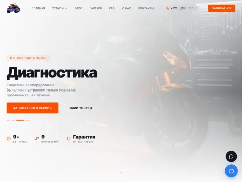
Website development, creation of a unique design and integration into the CMS for the ReMOTO workshop, which has been repairing and servicing motorcycle equipment in Minsk since 2016.
Nine service areas are laid out on the site - diagnostics, repair and scheduled maintenance of motorcycle equipment, tuning, a motorcycle tow truck, spare parts and accessories, repair of electric bikes and electric transport, assembly and repair of battery packs - together with a blog, a gallery of completed works, an FAQ section and an online booking form.
The workshop deals with very different machines - from a road motorcycle to an electric scooter - so the structure of the site starts from the type of vehicle: separate pages for motorcycles, ATVs and snowmobiles, mopeds and scooters, electric scooters and electric bikes. A visitor finds their own machine first and only then the kind of work it needs.
The articles section covers concrete repairs, such as replacing the rear steering knuckle on a Racer 350 ATV, restoring a speedometer drive or fixing a scooter's ignition system. These texts bring in people who search for a specific fault, and the gallery of completed work and the "They trust us" block help them decide to bring the machine in.
The diagnostics page explains what sets the workshop apart: besides checking the mechanical condition, the electrical systems are tested with a professional TEXA diagnostic set, diagnostics are free for clients who order the repair, and the work order is not inflated - only real problems are reported. The phone number and the "Book a service" button stay in the header on every page, and the FAQ answers the questions about prices, timing and warranty.
ReRB - free counterparty check against official registries
Website: https://rerb.org
Type of work: Design development, layout, web service development
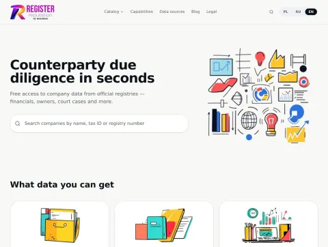
Development of a unique design and of a web service for checking counterparties. The site aggregates data from public state registries only - the tax registry, the Polish National Court Register (KRS), the statistics office and annual accounting filings - and assembles a company profile in seconds.
Search by company name, tax ID or registry number, a catalogue of companies by cities and regions, registration details, directors and beneficial owners, activities, headcount, financial indicators and litigation history. The interface works in three languages (PL, RU, EN); the service also has a blog and a legal section.
People come to a counterparty check with one concrete question - can this company be trusted with a contract or a payment - so the first screen is a single search box that accepts a name, a tax ID or a registry number. The company profile that opens next goes from the most requested data to the least: registration details and status, then owners and directors, then financial indicators by year and finally court cases.
Each block names its source, whether the tax registry, the KRS, the statistics office or accounting filings, so the user can see where a figure comes from and quote it in their own documents. Catalogues of companies by city and region and the lists of recently added cities and regions help search engines index the profiles.
The interface works in Polish, Russian and English, and the blog explains how to read the financial statements and registry entries shown in the profiles.
Naprawio.pl - a platform for finding renovation contractors in Poland
Website: https://naprawio.pl
Type of work: Design development, layout, web platform development
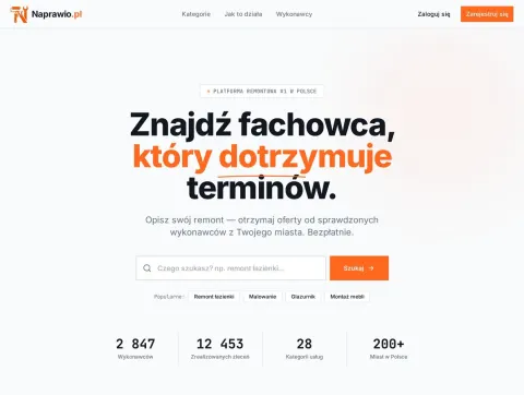
Development of a unique design and of a web platform that connects customers with renovation contractors. The customer describes the job for free and within 24 hours receives offers from verified contractors in their own city.
The platform covers 28 service categories - from apartment and bathroom renovation to painting, tiling, flooring and furniture assembly - in more than 200 Polish cities. It includes contractor profiles with ratings and reviews, a feed of open jobs and a separate registration flow for contractors.
The platform has two audiences with opposite goals, so they get separate paths from the very first screen. A customer sees a short form - what needs doing, where and roughly when - and a promise of offers within 24 hours; a contractor sees a feed of open jobs in their city and a registration flow that asks for their trade and service area.
Trust was the main design question: a customer lets a stranger into their home. That is why contractor profiles put ratings, reviews from previous clients and the list of completed jobs above the contact button, and categories are written in plain everyday words - bathroom renovation, painting walls, laying tiles, assembling furniture - the way people describe the job themselves.
The catalogue of 28 categories and more than 200 cities is the backbone of the search: a customer picks the kind of job and their city and sees only the contractors who actually work there, while a contractor chooses the same two things during registration and receives only the jobs that fit. Short distances matter in renovation work, so the city is never an afterthought in the interface - it is asked for at the very start of both paths.
Museum of Illusions Wrocław - website with online ticket sales
Website: https://muzeumiluzjiwroclaw.pl
Type of work: Design development, layout, CMS integration
Website development, creation of a unique design and integration into the CMS for the Museum of Illusions in Wrocław, which is located right on the city’s Market Square.
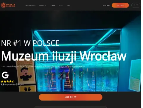
The site presents the exhibitions - the mirror maze, optical illusions, the ball pool and terrariums with exotic species - along with a group offer, a ticket price list with online purchase, visitor reviews, a blog and an FAQ section. The interface is available in Polish, English and Arabic.
Most visitors decide to come in on the spot or the evening before, often from a phone while walking around the Market Square, so the first screen answers three questions at once: what is inside, how much it costs and where to buy a ticket. The headline lists the main attractions - the mirror maze, optical illusions, the ball pool and terrariums with exotic species - next to the rating from several hundred reviews and a "Buy a ticket" button that stays visible in the header on every page.
The block "What do you get with a ticket?" turns the visit into concrete expectations: 45-60 minutes inside, the largest mirror maze in Poland, optical installations and a chance for memorable photos. Prices start from 19 PLN, and the price list explains that buying online is cheaper than at the door.
Groups have a separate menu with three entry points - companies, private groups and schools - because each of them plans a visit differently and asks different questions. The gallery of illusions, the blog and the FAQ cover the rest, and switching between Polish, English and Arabic is available in the header for tourists who come to Wrocław from abroad.
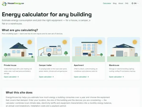
EnergyHouse.top - free online energy calculator for buildings
Website: https://energyhouse.top
Type of work: Design development, layout, web application development
Development of a unique design and a single-page web application for an online energy calculator. The service builds a monthly energy balance for a private house, a camper trailer, an apartment or a warehouse from real climate data - temperature, solar irradiance and wind speed for hundreds of locations worldwide.
The user adds the equipment being considered - solar panels, batteries, a heat pump, an air conditioner or a camper power station - and immediately sees how it changes the balance: installation cost, annual expenses, savings and the payback period in the local currency. The calculation is free, needs no sign-up, can be shared by a link or exported to PDF, and the interface is available in four languages.
An energy calculation usually means spreadsheets and tables of coefficients, so the main design task was to hide that complexity without hiding the numbers. The user starts by choosing the type of building and its location, and the application pulls in the climate data for that place on its own; everything else is entered in plain terms - floor area, insulation, the number of people living there, the appliances in use.
The monthly balance is shown as a chart where consumption and production sit side by side, so it is immediately visible in which months a solar installation covers the demand and when the house still depends on the grid. Every piece of equipment added to the plan changes the chart and the totals at once: installation cost, yearly expenses, savings and payback period. This turns the calculator into a tool for comparing options rather than a one-off estimate.
A finished calculation can be sent by link to a family member or an installer, or saved as a PDF for a meeting with a supplier.
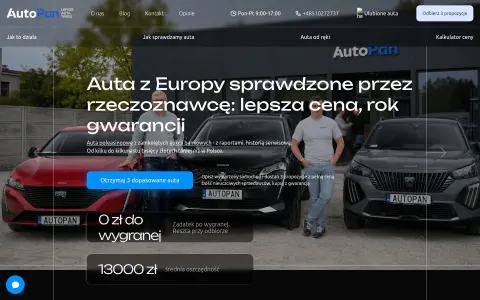
AutoPan - buy cars from Europe up to 30% cheaper
Website: https://autopan.pl
Type of work: Design development, layout, CMS integration
Website development, creation of a unique design, integration into the CMS of a platform for buying verified used cars from Europe with delivery to Poland.
Buying a used car from another country raises an obvious fear - what if it turns out to be different from the photos - so the whole site is built around removing that fear step by step. The main promise is stated in the first screen: cars from Europe checked by an independent appraiser, with a warranty of up to three years. Most of them are post-lease vehicles from banks, with an appraiser's report and a documented service history.
The process is explained as a path with clear stages: the client describes the car they want - make, model, year, budget and equipment - and gets access to current offers with reports, photos and service documents. Viewing costs nothing; a deposit from 10% is paid only when the client decides to buy, and the rest is paid after the car is delivered and inspected. Logistics, insurance and paperwork with sellers in Germany or Belgium are handled by a personal account manager, whose role has its own section on the site.
Price tables for popular models, the weekly list of won cars, client reviews and a comparison of the AutoPan route with the typical path on the used-car market back up the promise of saving up to 30%. The request form at the end promises a callback and help with choosing a car.
Every offer shows a price that already includes transport and registration in Poland, and this final amount is written into the contract.
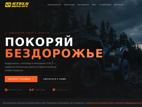
STELS ATVs, snowmobiles and motorcycles online store in Belarus
Website: https://stelsmotoatv.by
Type of work: Design development, layout, CMS integration
Website development, creation of a unique design, integration into the CMS of the official STELS dealer's site selling ATVs, snowmobiles and motorcycles in Belarus.
The dealer sells machines whose prices range from a small ATV to a flagship that costs several times more, so the catalog is split into three clear groups right on the home page: ATVs (six models), snowmobiles (five models) and motorcycles (four models). Each group shows the number of models, which helps the visitor understand the scale of the range before clicking.
The flagship ATVs of the Gepard and Leopard lines are presented as a separate block with the starting price of every model, from the ATV200 Leopard to the ATV1000 Gepard 2.0. Showing "from" prices openly on the first screen saves both the buyer's and the manager's time: people who call already know which budget they are talking about.
The "Why buy from us" section brings together the arguments that matter for heavy equipment: an official 24-month warranty, the dealer's own service centre in Minsk, delivery across Belarus and purchase on credit or in instalments. The final "Ready to buy?" block leads to the contact form, so a visitor who has made up their mind does not have to look for a phone number.
The flagship cards list the engine volume, power and all-wheel drive right on the preview, for example 1000 cm³ and 80 hp for the Gepard 1000, because these are the first numbers people compare. A separate block speaks to hunters, anglers and expedition travellers, and the showroom on Zapadnaya Street near the Minsk ring road is presented with its parking and opening hours.
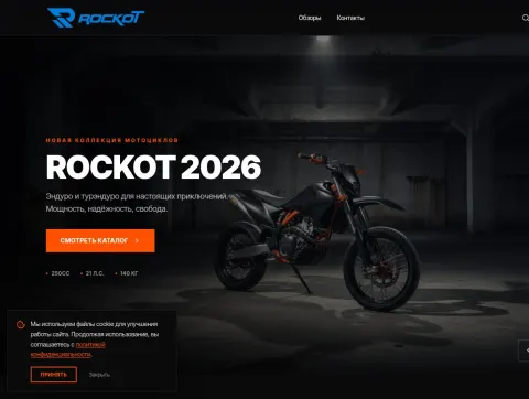
Online store of ROCKOT motorcycles, mopeds, scooters and riding gear
Website: https://rockotmoto.by
Type of work: Design development, layout, CMS integration
Website development, creation of a unique design, integration into the CMS of a site selling ROCKOT motorcycles, mopeds, scooters and riding gear.
ROCKOTMOTO.BY is the official dealer of the ROCKOT brand in Belarus, and its catalog is unusually wide for a motorcycle store - more than 15,000 items, from enduro, touring enduro, road and motocross bikes and pit bikes to mopeds, scooters, helmets, protection, gloves, goggles and spare parts. With a range like this, navigation matters more than decoration, so the catalog starts from four large sections - motorcycles, mopeds, scooters and riding gear - and each of them has a one-line explanation of who it is for: mopeds for the city and trips out of town, scooters as economical everyday transport.
The "Why ROCKOTMOTO.BY" block answers the questions people ask before buying a vehicle from a dealer: more than 15 years of work with motorcycles and the company's own brand, an official warranty of 12 to 24 months with a service centre in Minsk, delivery across Belarus or pickup from the Minsk warehouse, credit and instalments from partner banks for up to 36 months, and original spare parts in stock.
The contacts - the address on Zapadnaya Street, the phone, the email and the daily opening hours from 10:00 to 18:00 - are written out in full on the home page, and the footer links to delivery and payment, the FAQ and the blog.
The bestsellers show real models with the price and "in stock" status, and the blog publishes reviews of specific bikes, such as the Montana 250 enduro or the Alpha City M-12 moped.
KAYO motorcycles, pit bikes and ATVs online store in Belarus
Website: https://kayomoto.by
Type of work: Design development, layout, CMS integration
Website development, creation of a unique design, integration into the CMS of the official KAYO dealer's site selling motorcycles, pit bikes and ATVs in Belarus.
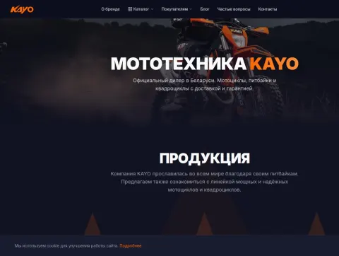
KAYO is a brand that riders often know by its pit bikes, so the site speaks first to that audience: the home page names the three directions of the range - pit bikes, enduro motorcycles and ATVs - and immediately adds the arguments that matter to buyers of this kind of vehicle: an official warranty, a store and a service centre in Minsk, delivery anywhere in Belarus and the option to pay in instalments.
Instead of a long list, the home page offers a short picker, "We will pick a vehicle for you": in three steps it asks what kind of riding the buyer has in mind - enduro and off-road, motocross, pit bike and mini, or ATV - and narrows the range accordingly. Next to it, the bestsellers and new arrivals show real models with prices in roubles and a clear status - in stock, at the warehouse or to order - so the buyer knows at once whether the bike can be picked up this week. The arguments are spelled out without small print: free delivery in Minsk and shipping to every region, instalments and credit from 3 to 24 months with no down payment, and an official warranty backed by the dealer's own service centre.
Because the site belongs to an official dealer, the Cyrillic spelling of the brand name, "Кайо", is used alongside the Latin one in titles and texts - this is how many people type it into a search engine, and it helps the dealer's pages appear in those results.
Enduro motorcycles online store in Belarus
Website: https://enduromoto.by
Type of work: Design development, layout, CMS integration
Website development, creation of a unique design, integration into the CMS of a site selling Progasi, Rockot and Motoland enduro motorcycles with delivery across Belarus.
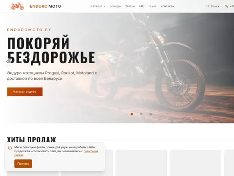
Unlike a single-brand dealer, Enduromoto.by brings together several manufacturers - Progasi, Motoland, Racer, BSE and Kayo - so the catalog is organised by the kind of motorcycle instead of by brand: enduro, touring enduro, motocross bikes and pit bikes. A rider who knows what they want to do off-road finds the right section first and compares brands inside it.
For those who are not sure yet, the home page offers a "We will pick a motorcycle for you" block with a consultation request, and the blog explains the differences that confuse beginners: whether to choose a pit bike or an enduro bike, what touring enduro actually is and how to choose protective gear. The bestsellers block, with pit bikes such as the Racer CRF 125 and TRZ 125 with an electric starter, shows what most buyers start with.
The arguments for buying here are kept short and placed where they are noticed - a 12-month warranty, 0% instalments, delivery across Belarus and a showroom in Minsk where the bikes can be seen in person before ordering. The motto "Conquer the off-road" on the first screen sets the tone for the whole site.
A three-question picker asks what kind of riding the buyer has in mind - off-road, touring, motocross or city - and suggests the best option. Wholesale clients can request an individual offer through the question form, and delivery across Belarus takes from one day.
TMBK scooters, motorcycles and pit bikes online store in Belarus
Website: https://tmbk-moto.by
Type of work: Design development, layout, CMS integration
Website development, creation of a unique design, integration into the CMS of the official TMBK dealer's site selling scooters, motorcycles, pit bikes, enduro bikes and boat motors in Belarus.
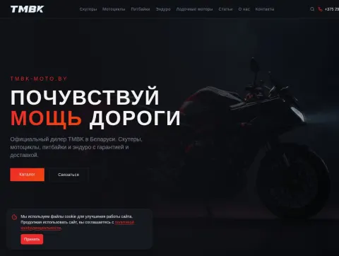
TMBK covers several very different classes of vehicles, from a city scooter to a 650 cc road motorcycle, so the home page asks the visitor to choose a class first. Four large tiles - scooters for urban mobility, motorcycles, pit bikes and enduro - show how many models each class contains, and the boat motors that the dealer also sells have their own item in the main menu instead of being buried among the motorcycles.
Below the tiles each class opens as a horizontal row of model cards with a price in roubles and a clear status: in stock, at the warehouse or to order. For enduro alone there are about sixteen models, from the Envy 250 to the Revolta 450 EFI, and seeing the whole row at once makes it easy to compare engine sizes and prices without leaving the home page.
The arguments of the official dealer are kept to one line under the headline - a 12-month warranty, delivery across Belarus, credit and instalments - and the news and articles sections give the site fresh content between seasons.
The boat motors have their own row as well, from the compact two-stroke Marine Pro T2.5 to four-stroke engines. The closing text of the home page lists the regional cities the dealer works with, the showroom address on Zapadnaya Street for pickup, and invites undecided buyers to read the model reviews - for example of the Revolta 450 EFI or the Envy 300 PRO - or simply to call.
Minako electric bicycles online store in Belarus
Website: https://minako.by
Type of work: Design development, layout, CMS integration
Website development, creation of a unique design, integration into the CMS of a site selling Minako electric bicycles with delivery across Belarus.
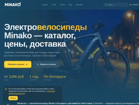
An electric bicycle is bought by two quite different groups of people: those who need a daily ride to work across the city and those who want something sturdy for the countryside, the dacha or rough tracks. The home page names both use cases in its first sentence and keeps the key facts in three short figures under the headline - prices from 1,299 roubles, a one-year warranty and delivery anywhere in Belarus - with a call-back request next to the catalog button.
The text below the first screen promises help with the decisions that are hardest for a newcomer: which motor power, which battery and which configuration suit a particular riding style and budget. Popular models, such as the Monster 1.0, the Apex or the F11 PRO with a 20 Ah battery, are shown with a price and stock status, so it is clear what can be delivered right away.
The news section reports on new models, price cuts on accessories and spare parts lists for the F10 and F11 series, and the articles section publishes full reviews - for example of the folding F10 PRO fat bike with 20-inch wheels. Together with the FAQ, these pages answer most questions before the buyer even calls.
Customer reviews with concrete details, such as the range in the city, and free delivery for orders over 1,000 BYN complete the page.
Racer Motors - motorcycles, scooters and ATVs online store in Belarus
Website: https://racer-motors.com.by
Type of work: Design development, layout, CMS integration
Website development, creation of a unique design, integration into the CMS of the official Racer dealer's site selling motorcycles, scooters and ATVs in Belarus.
Racer has one of the widest model ranges on the Belarusian market - road and enduro motorcycles, pit bikes and motocross bikes, cargo tricycles, scooters, mopeds and ATVs with engines from 50 to 300 cc - so the main navigation tool on the home page is a picker with three questions: the type of vehicle, the budget (up to 4,000, 4,000-8,000, 8,000-15,000 or over 15,000 BYN) and the purpose, from the city and the dacha to off-road riding, hunting and fishing or the track. The catalog counters next to it show the scale: about fifty motorcycles, fourteen mopeds, fourteen ATVs and eleven scooters.
Financing is the first message of the site, because it is the question most buyers ask: 0% instalments for up to 12 months and credit for up to 36 months with a passport only and a decision in 15 minutes. The promotions block shows current discounts by category with the exact saving.
The introductory text explains what comes with every vehicle - a factory warranty of up to 24 months, pre-sale preparation and a full set of documents for registration - and lists the cities where delivery takes one or two days, from Brest and Grodno to Gomel, Vitebsk and Mogilev.
The request form at the end asks only for a name, a phone number and the model of interest; the manager then picks a model and calculates the instalment plan.
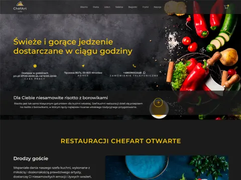
Chef Art Cafe — cafe website design and development
Website: https://chefartcafepl.purplelabs.eu/
Type of work: Design development, layout, CMS integration
Website development, creation of a unique design, integration into the CMS of the site.
Chef Art Cafe in Wrocław cooks Italian-style dishes and home comfort food and delivers them across the city, so the site works first of all as an ordering tool. The top bar answers the three questions a hungry visitor has before anything else: whether the kitchen is open right now, where the cafe is (Tęczowa 80/1c) and which number to call for a phone order. The promise in the header is simple - fresh, hot food delivered within an hour.
The menu is split into short categories that match how people actually choose food: main sets, breakfasts, risotto, udon, pasta, salads, burgers, hot dogs, pierogi, starters, desserts, drinks and beer. Every dish has its weight, price and an "Add to cart" button right on the card, so an order can be put together without opening a separate page for each item.
The slider at the top tells short stories about signature dishes - risotto with mussels in a creamy sauce, risotto with porcini mushrooms, a vegetarian version with aubergine and courgette, pasta arrabbiata and pasta with pancetta. These texts work as recommendations from the chef and help a visitor who does not know what to choose yet.
Alongside Italian dishes, the menu has plenty of home-style food - chicken and fish cutlets, fried cheese with cranberry sauce, pljeskavica with ajvar, bigos with mushrooms - and a separate children's section with small portions and simple prices.
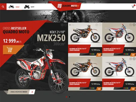
QuadroMoto — online store for ATVs and motorcycle equipment
Website: https://quadromoto.store/
Type of work: Design development, layout, CMS integration
Website development, creation of a unique design, integration into the CMS of a site selling ATVs and motorcycle equipment.
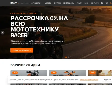
QuadroMoto sells to buyers in Belarus and Poland, so the language switch between BY and PL sits at the very top, prices are shown in euros, and the main menu is reduced to four large sections: ATVs, motorcycles, electric cars and other electric transport, plus a separate sale page. The scrolling ribbon under the header announces the bestsellers, and the first products a visitor sees are real models with prices, from E-TWOW and Segway electric scooters to a QMC crossbike.
The long guide on the home page is written for someone choosing an ATV for the first time. It explains the parameters that actually decide the purchase: engine power depending on terrain, load and speed; the type of wheels or tracks for snow, ice, swamp, sand or the city; the maximum load for children's models, adult models and machines that will pull a trailer or a snowplough; and the choice between a battery for the city and suburbs and a petrol engine for forests, fields and long distances.
This text helps visitors who are not sure what they need and, at the same time, gives the home page enough useful content to rank for general ATV searches.
The articles section continues this approach with practical guides, for example on choosing an electric quad for a child, with safety tips and the advantages of a quiet, fume-free vehicle for the backyard or park paths.
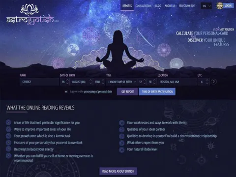
Astro Jotish — astrology website design and development
Website: https://astrojyotish.info
Type of work: Design development, layout, CMS integration
Website development, creation of a unique design, integration into the CMS of a site on astrology.
Astro Jotish is built around a free Vedic birth chart that is calculated on the server and explained in full, so the form sits right on the first screen. It asks for a name, the date, the time and the place of birth; when the visitor starts typing a city, the latitude, longitude and the time zone in force on that date are filled in automatically. Instead of a person, the chart can be drawn up for an event - a company registration, a wedding or a move - which is why the form also has an event type.
The text under the form explains why the exact time matters: the ascendant, the house cusps and the navamsha shift with every few minutes. For people who do not know their time of birth, the site offers a rectification questionnaire that narrows the interval down from the events of their life.
The interpretation covers the main chart, divisional charts and the life periods (dashas), and the list "What a Jyotish birth chart reading reveals" sets clear expectations - from the areas of life that matter most to the qualities of an ideal partner. Calendar, date selection, consultations and charts of famous people complete the menu, and the interface works in English, Russian, Polish and German.
The calculations follow the Surya Siddhanta mode used by Jagannatha Hora, which we studied and re-implemented so that the positions of the planets, houses and signs are obtained on the site itself. A section on how Vedic astrology differs from Western astrology explains the sidereal zodiac and the ayanamsha of about 24 degrees, which is why a Vedic chart usually puts the Sun in the preceding sign.
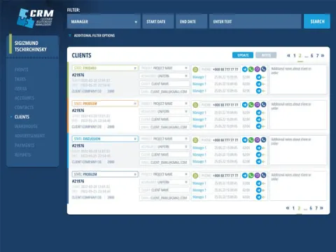
CRM system — customer relationship management platform
Website: https://purplelabs.eu/demo/crm/auth.php
Login: demo Password: demo
Type of work: Design development, layout
Development of a unique design, layout, implementation of the CRM.
BoosterCRM is our own web CRM for small businesses, and this project covered its interface from the login screen to the last report. The starting point was a typical situation in a small company: requests arrive in messengers, phone numbers are kept in a notebook, orders in a spreadsheet, and when a manager goes on holiday nobody knows which customer was promised a call-back. The design had to bring all of this into one place without turning a simple tool into enterprise software that needs months of rollout.
The system runs in the browser on a computer, tablet or phone, and every section was laid out for a mobile screen as well: a manager can open a client card on the road, and a warehouse employee can mark a shipment straight from the storeroom. Clients, leads, tasks, sales, payments, warehouse stock, shipments, payroll and reports are linked to each other, so every record leads to the client and the project it belongs to.
Access rights were designed in detail - roles, departments and per-employee access to projects and menu sections - so each person sees only their own work. The demo version linked above can be opened with the login and password "demo".
The system has eighteen modules, but the interface does not require all of them on day one: most teams start with clients, leads and tasks and turn on sales, the warehouse or payroll later.
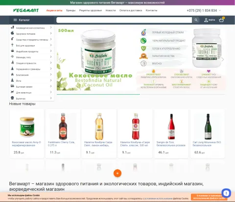
Online store selling natural products, Indian and eco goods Vegamart
Website: https://vegamart.by
Type of work: Design development, layout, CMS integration
Website development, creation of a unique design, integration into the CMS of a site selling natural products, Indian and eco goods.
Vegamart is a healthy-food and eco-goods store with a strong Indian accent, and its range is unusually varied: Ayurvedic cosmetics, healthy food, hygiene products, Indian groceries, mehendi and henna tattoo kits, spices, jewellery and souvenirs, incense, yoga accessories, household chemicals, products for pets and bakery goods. With so many unrelated categories, the catalog had to be the main navigation tool, so it opens as a single list in the header on every page, next to the sections for promotions and bestsellers, brands, health recipes, news, payment and delivery.
The home page shows new arrivals as a scrolling row of product cards with a volume and a price - coconut oil, kombucha, craft lemonades and alcohol-free wines - which makes the store feel alive for regular customers who come back to see what has changed. Below the products there is a long text that explains the store's philosophy: why natural products matter, what eco-products do not contain (pesticides, antibiotics, sulphates, parabens, artificial fragrances) and why Ayurvedic cosmetics appeal to people who read labels carefully.
This text speaks the language of the store's audience, people who have consciously moved to natural goods, and at the same time gives search engines a clear picture of what Vegamart sells. The "Health recipes" section connects the products with everyday cooking and gives regular visitors another reason to come back.
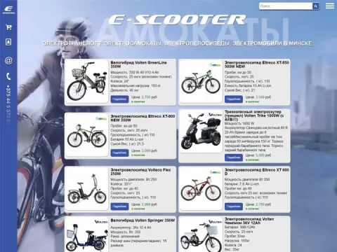
Online store selling electric vehicles
Website: https://eskuter.by
Type of work: Design development, layout, CMS integration
Website development, creation of a unique design, integration into the CMS of a site selling electric vehicles.
ESKUTER sells several kinds of electric transport at once - electric scooters, electric bikes, electric quads and even children's models - and buyers of these vehicles compare them by a handful of numbers. That is why every product card on the home page shows the key specifications right in the preview: motor power, top speed, range, maximum load and weight. A visitor can see that, for example, the Segway-Ninebot Kickscooter F2 Pro has a 450 W motor, a range of 55 km and weighs 17 kg, and compare it with a lighter children's model without opening either page. The price and the availability status - in stock or to order - sit on the same card.
The second half of the home page is devoted to content: reviews of specific electric bikes, such as the Kugoo Kirin V3 and V6 or the GreenCamel Mustang, a guide on how to choose a hybrid bike, and news about new models with real-life tests - a scooter on rough roads and climbs, a children's scooter for long walks, an electric scooter with a removable battery. These texts answer the questions people ask before spending money on their first electric vehicle and bring in visitors from search engines.
The phone number is always in the header, and the footer keeps the catalog and the sitemap within reach.
The catalog is open from the first screen, so a returning visitor can skip the reviews and go straight to the models.
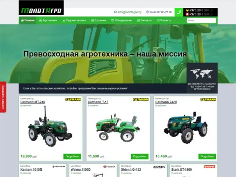
Website for the sale of agricultural machinery in Minsk: two-wheel tractors, mini tractors, garden equipment
Website: https://energyagro.by
Type of work: Design development, layout, CMS integration
Website development, creation of a unique design, integration into the CMS of a site selling agricultural machinery in Minsk: two-wheel tractors, mini tractors, garden equipment.
Energyagro.by sells agricultural machinery in Minsk - two-wheel tractors, mini tractors and garden equipment - to people who work their own land: owners of country houses and dachas, small farms and households with a large garden. For this audience a machine is a long-term investment rather than an impulse purchase, so the site had to make comparison easy and give enough technical information to decide without a trip to the store.
Two-wheel tractors, mini tractors and garden equipment are chosen by completely different criteria, so the catalog is divided by the type of machinery. For walk-behind and compact tractors the deciding parameters are usually engine power, the working width, the type of transmission and the attachments that can be used with the machine - ploughs, hillers, potato diggers, mowers or trailers - while for a lawn mower or a trimmer the size of the lawn and the type of grass matter more. The design had to leave room for exactly this kind of information, because buyers of agricultural machinery read specifications before they read anything else.
Our work covered the design, the layout and the integration into the CMS. The CMS lets the store's managers update prices, add new models before the season and publish promotions on their own, without waiting for a developer - important for a business whose sales peak in spring.
The contacts of the Minsk store are repeated on every page.
PhoneKeeper website by TPN Development Group, which specialises in developing mobile applications for Android and iOS
Website: https://phonekeeper.net
Type of work: Design development, layout, CMS integration
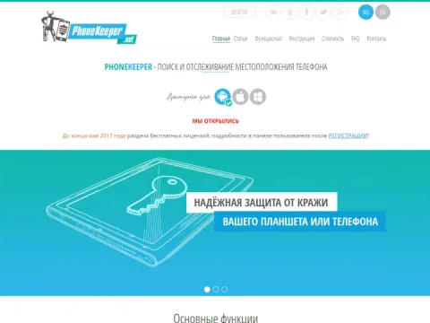
Website development, creation of a unique design, integration into the CMS of the site for PhoneKeeper.net - location search and phone tracking.
PhoneKeeper is a mobile application by TPN Development Group that collects and stores information from an Android device: the location of the phone in real time, incoming and outgoing calls and their duration, messages, social network activity and the contact list. The site had to present a technically complex product to ordinary people and explain at once who it is for. The text on the home page names three scenarios - keeping a child safe by seeing what happens on their phone, monitoring employees' work devices to improve the efficiency of a company, and keeping track of where elderly relatives are.
The main functions are shown as a short row of icons right under the slider: GPS tracking of movement, recording of calls and surroundings, viewing SMS messages, monitoring of social networks, remote control and access to contacts. The main menu follows the path of a new user - from articles and a description of the functionality to the installation guide, prices and the FAQ - and the login to the user panel is always available in the header.
The site works in Russian and English. At launch, the slider announced free licences for new users who registered by the end of May 2017, and the partner programme page invited resellers to join.
Round-the-clock support and a simple interface are named on the home page as the product's main advantages after its functions.
Website selling motorcycle spare parts and accessories for motorcycles and ATVs
Type of work: Design development, layout, CMS integration
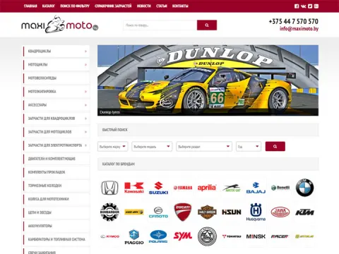
Website development, creation of a unique design, integration into the CMS of a site selling motorcycle spare parts and accessories for motorcycles and ATVs.
Maximoto.by is an online store of spare parts and accessories for motorcycles and ATVs. A parts store is a very different job from a store that sells the vehicles themselves: a buyer does not browse for inspiration but looks for one specific part that fits one specific machine, and a mistake means a return, lost time and a bike that stays in the garage. The design of the site was therefore built around finding the right part quickly rather than around large photos.
The catalog separates parts for motorcycles and for ATVs. Riders and mechanics think about parts in groups - engine, transmission, brakes, suspension, electrics, body parts, tyres and consumables - and the information they check before buying is always the same: the article number, the models and engine sizes the part fits, and whether it is in stock. Accessories and riding gear are a different kind of purchase, closer to a regular online store, and it makes sense to keep them apart from technical parts.
Our work covered the design, the layout and the integration into the CMS, which allows the store to load and update a large range of items on its own. For a parts business this matters more than for most stores: the range is wide, prices and availability change often, and the catalog grows with every new model of motorcycle or ATV that appears on the market.
Website selling eco-friendly straw panels
Type of work: Design development, layout, CMS integration
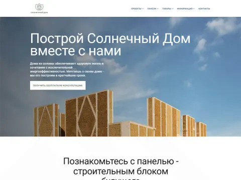
Website development, creation of a unique design, integration into the CMS of a site selling eco-friendly panels.
Solarhouse.by sells eco-friendly panels made of straw - a building material that is still unfamiliar to most people, even to those who are planning a house. Straw panels are produced by compressing straw under high pressure into dense boards; the material comes from an agricultural by-product, insulates against heat and noise and is used for partitions, interior walls and the insulation of walls and roofs. Because buyers usually come to the site with doubts rather than with a ready decision, the main task of the design was to explain the material before trying to sell it.
For this reason the site is meant to lead the visitor from questions to products: what straw panels are and how they are made, where they can be used and how they compare with familiar materials such as plasterboard or chipboard, and only then the catalog. A buyer who understands the material is more likely to trust it with their walls.
The audience includes both private builders and companies that build frame houses or renovate interiors, and both groups need to see the product clearly before they get in touch. Our work covered the design, the layout and the integration into the CMS, which lets the client add new products and update information and prices themselves as the range grows.
Straw is renewable, and that is part of the argument the site makes.
Website selling mini tractors and two-wheel tractors
Type of work: Design development, layout, CMS integration
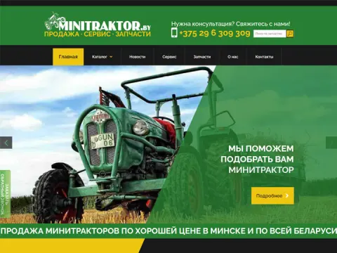
Website development, creation of a unique design, integration into the CMS of a site selling mini tractors and other machinery.
Minitraktor.by sells mini tractors and two-wheel tractors across Belarus. The buyers are owners of private plots, farms and small businesses who need a machine for ploughing, cultivating, mowing, transporting loads or clearing snow, and for most of them it is one of the largest purchases for the household. People in this position compare models carefully, read specifications and often call the store several times before deciding, so the site was designed to answer as many of these questions as possible on its own.
The catalog divides the machinery into mini tractors and two-wheel tractors, because these are two different budgets and two different scales of work. Buyers of such machines usually compare engine power and type, drive (2WD or 4WD for tractors), transmission, working width and weight, and they think about attachments at the same time, since a tractor is almost always bought together with a plough, a cultivator, a mower or a trailer. The design had to make room for this level of detail without making the pages hard to read.
Because the store sells across the whole country, delivery is part of the promise from the very first line. Our work covered the design, the layout and the integration into the CMS, so that the store can update prices and stock before each season on its own.
Prices and stock change with the season, and the store keeps them current itself.
Official website of Molot Motors Group - sale of motor vehicles in Minsk
Type of work: Design development, layout, CMS integration
Website development, creation of a unique design, integration into the CMS of a site selling ATVs, motorcycles, buggies and other motorcycle equipment in Minsk
Molot Motors Group is a Minsk company that sells motorcycle equipment of several kinds at once: ATVs, motorcycles, buggies and other vehicles for leisure and work. The site we built for it, Minimoto.by, was the company's official web presence, so it had two jobs - to work as an online store and to represent the group itself as a reliable dealer that a buyer can visit in person in Minsk.
A buggy, a quad and a road motorcycle are bought by different people for different reasons. Someone choosing a buggy is usually thinking about weekend rides with a passenger, an ATV buyer often needs a machine for a country house, hunting or fishing, and a motorcycle buyer compares engine size, riding position and price. The structure of the catalog follows these categories rather than one long list, so each visitor can go straight to the type of vehicle they came for and compare models within it.
The search phrases the site was written for show what local buyers type into a search engine: motorcycle equipment in Minsk, sale of ATVs, sale of motorcycles, an online motorcycle shop. Category pages and texts were planned around these queries, and the company name was kept in titles so that people who already knew Molot Motors Group could find the official site rather than a reseller.
Our work covered the design, the layout and the integration into the CMS, which allows the company to add new models and change prices without a developer.
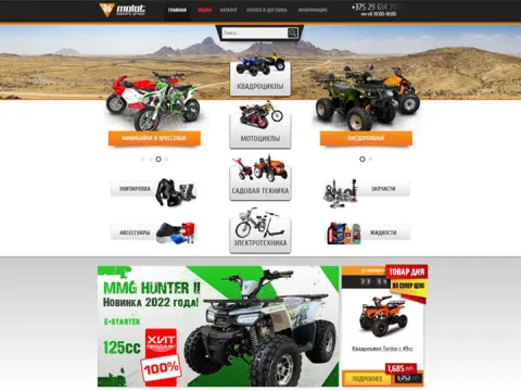
idiag.by shop website - the best supplier of car computer diagnostics equipment
Type of work: CMS integration
Integration into the CMS of an online shop selling quality diagnostic equipment for cars in Minsk.
idiag.by is a Minsk online store that sells equipment for computer diagnostics of cars: scanners, adapters and other tools that read error codes from a vehicle's control units and show the state of its systems. Its customers are mostly professionals - car service stations, independent mechanics and auto electricians - together with experienced car owners who prefer to find the cause of a check-engine light themselves before going to a workshop.
Unlike most projects in our portfolio, this was not a full design job. The store already had its own look, and our task was to connect it to a CMS so that the owners could manage the catalog without a developer: add new devices, change prices, update descriptions and mark what is in stock. For a shop that sells technical equipment this matters a great deal, because the range changes as manufacturers release new models and software versions, and every change needs to appear on the site quickly.
Buyers of diagnostic equipment read before they buy. They want to know which car makes and protocols a scanner supports, whether it works with a laptop or a phone, and what functions it offers beyond reading and clearing error codes. A CMS makes it possible to keep such descriptions complete and consistent across the whole catalog, so that the store can be found for queries such as car diagnostics, computer diagnostics or diagnostic equipment and answer the questions of a professional audience on the product page itself.
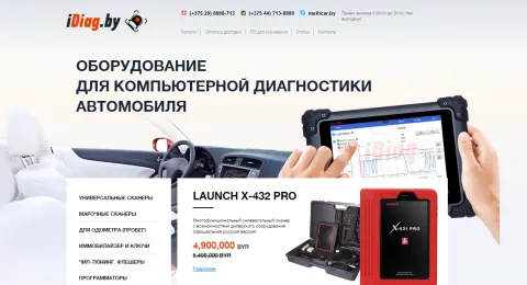
Tirexline - website of a transport company specialising in international road freight
Type of work: Redesign
Creation of a new unique design for the website of a company engaged in international freight transport.
Tirexline is a transport company that specialises in international road freight. Its clients are businesses that need to move goods across borders - manufacturers, distributors and trading companies - and for them choosing a carrier is a question of trust: a truck that arrives late or a load that is damaged costs real money. A carrier's website is therefore often the first test. It has to show at a glance what the company transports, in which directions and on what terms, and how quickly someone will answer a request.
The project was a redesign. Tirexline already had a site, and our task was to create a new, unique design for it that would look like the website of a serious logistics partner rather than a generic template. In freight transport the information a client looks for is fairly constant: the types of cargo and vehicles, the countries and routes, the documents and customs formalities the company can handle, and a simple way to request a quote. The new design gives this information a clear order and makes the contact and request options easy to find from any page.
The search phrases the site was meant to answer - freight transport, road transport, cargo delivery, international freight transport, freight transport in Minsk - describe exactly the moment when a company is looking for a new carrier. A clear, modern design helps turn that search into a request, because a client who sees order on the website is more willing to believe there will be order on the road as well.
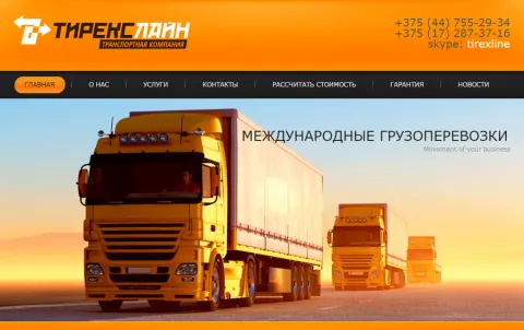
Nova Telecom company - mobile services and communication services in Belarus
Type of work: Design development, layout, CMS integration
Development and creation of a website for "Nova Telecom", a company providing mobile communication services in Belarus.
Nova Telecom is a company that provides mobile communication services in Belarus. The market for such services is crowded with large operators and their partners, so a smaller provider needs a website that explains clearly what exactly it offers, to whom and on what terms. People who come to a telecom site usually have a concrete task - to connect a number, to compare plans, to find out how to pay or to get help with a problem - and the site has to lead each of them to the right page without making them read everything else.
We developed the design, made the layout and integrated the site into a CMS. The main sections follow the questions of the company's clients: the list of mobile services, the terms of connection, information for business customers and private users, news about new offers, and contacts for support. The design keeps the pages calm and readable, because telecom tariffs and conditions are full of details, and a busy layout would only make them harder to understand.
The CMS lets the company update plans, publish news and change prices on its own. In telecommunications this is a practical necessity rather than a convenience: offers change often, and an outdated price on the website quickly turns into an unhappy customer. The search phrases the site addresses - mobile communication in Belarus, mobile services, mobile operator - show that it was planned to be found by people who are actively choosing a provider.
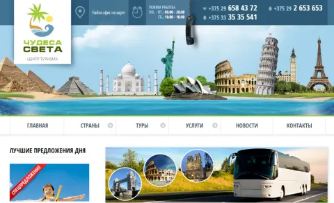
Website for travellers and tourists of the tourism centre "Wonders of the World"
Type of work: Design development, layout, CMS integration
Development and creation of a website for the tourism centre "Wonders of the World" - the best guide for beginner and experienced travellers.
The tourism centre "Wonders of the World" wanted more than a list of tours: the site was planned as a guide for travellers, both for people who are going abroad for the first time and for those who already have dozens of trips behind them. That is a different goal from a typical travel agency website, which mostly shows prices and departure dates. A guide has to be useful even to a visitor who is not going to buy anything today, because that is how a travel company earns the trust that later turns into a booking.
Our work covered the design, the layout and the integration into the CMS. The design had to combine two kinds of content on one site: inspiring material about destinations and practical information - where to go in summer, what to see, how to plan the trip - together with the commercial part, the offers of the tourism centre and the way to contact it. Large images of places do much of the work in travel, so the layout gives them room, while the texts are kept in a readable column so that a guide article can actually be read to the end.
The search phrases the site was written for - tourism, travel, travel and leisure, where to holiday in summer, a guide for travellers - show the intention clearly: to meet people at the stage when they are only dreaming about a trip, and to be the company they remember when the time comes to book it. The CMS allows the centre to add new destinations and publish seasonal offers on its own.
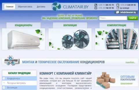
Climateair - sale of air conditioners, dehumidifiers, humidifiers, servicing of climate equipment
Type of work: Redesign
Creation of a new unique design for the website of a company selling air conditioners, dehumidifiers, humidifiers and their components.
Climateair sells and services climate equipment: air conditioners, dehumidifiers, humidifiers and their components. It is a wider range than in a typical air-conditioner shop, and the buyers are different too. Someone looking for a dehumidifier usually has a damp basement, a bathroom without ventilation or a room where laundry is dried; someone looking for a humidifier is more often worried about dry air in a heated apartment in winter, and especially about children's health. These people arrive with a problem rather than with a model name, so the site has to help them understand which device solves their problem before showing a catalog.
The project was a redesign: the company already had a website, and we created a new, unique design for it. The structure of the new design separates the main product groups clearly and gives equal room to the services - installation of air conditioners and servicing of climate equipment - because for many clients the service is the deciding factor. An air conditioner that is installed badly will work badly, and buyers know this.
The search phrases the site addresses show this mixture of product and advice: buy an air conditioner, dehumidifiers in Minsk, buy a humidifier, air conditioner installation, which humidifier to choose. The last one is a question rather than a product, and answering such questions on the site is what turns a hesitant visitor into a customer.
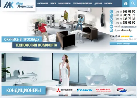
"Climate World" - air conditioners, ventilation systems and other climate equipment
Type of work: Design development, layout, CMS integration
Creation of a unique design for the website of a company selling air conditioners, split systems and other climate equipment.
"Climate World" is a company that sells and installs air conditioning and ventilation systems. Its range covers household air conditioners of every common type - split systems, window units and portable air conditioners - as well as ventilation systems, which are a separate and more technical subject. A buyer of a portable air conditioner for a rented flat and a buyer planning ventilation for a whole house need very different information, and the site had to serve both without confusing either of them.
We created a unique design for the website and handled the layout and the integration into the CMS. The main structure divides the range by type of equipment, because the type is the first decision a buyer makes: a split system needs installation and a place for the outdoor unit, a window air conditioner needs a suitable window, and a portable unit needs nothing but a socket and an outlet for the hose. Once the type is chosen, the buyer compares models by power, room size and price. The installation service sits next to the products, since for split systems and ventilation it is part of the purchase rather than an option.
The search phrases the site was built around - household air conditioners, split systems, window air conditioners, portable air conditioners, ventilation systems - reflect this division by type. Each of them leads to its own section, so a visitor who searched for a specific kind of equipment lands on the right page immediately. The CMS lets the company keep prices and models up to date before the summer season.
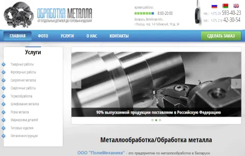
Polimekhanika enterprise - metalworking services in Minsk
Type of work: Design development, layout, CMS integration
Development and creation of a website for the "Polimekhanika" enterprise, which specialises in various metalworking services.
Polimekhanika is a Minsk enterprise that provides metalworking services: cutting and processing of metal, turning and milling, welding, drilling, part marking and the production of standard products. Its clients are mostly other businesses - manufacturers who need a batch of parts, repair shops that need a single component made to a drawing, construction and installation companies that need metal elements cut and welded. They come with a technical task and want to know quickly whether the enterprise can do it, how long it will take and how to send the drawing.
We developed the design, made the layout and integrated the site into a CMS. For an industrial company the main design challenge is to be clear rather than impressive. Each type of work has its own place in the structure, so that an engineer looking for milling or a buyer looking for metal cutting goes straight to the relevant service, sees what the enterprise can do and finds the way to place an order without reading about everything else. Photographs of equipment and finished parts say more to this audience than any slogan, because they show the real capabilities of the workshop.
The search phrases the site was planned around - metal processing, metalworking, milling, welding, metal drilling, metal cutting, part marking - are exactly the words a technical buyer types when looking for a contractor. Giving each of them a dedicated, clearly described service helps the enterprise be found by the right clients. The CMS lets Polimekhanika update its list of services and prices on its own.
farlin.by - quality and useful goods for loving parents and their babies
Type of work: Building the site engine
Building the engine of the farlin.by website - an online shop selling useful everyday goods for mothers and babies.
farlin.by is an online shop of everyday goods for mothers and babies: nappies, wet wipes, powders, toys and the many small things that a family with a young child buys again and again. The customers are parents who are short of time and sleep, and many of them shop from a phone in the evening or during a night feed. For this audience a children's shop has to be fast, predictable and trustworthy: finding the usual brand of nappies and repeating an order should take seconds, not a long search through the catalog.
Our part of this project was the engine of the site - the software base on which the shop runs. An online store of children's goods has a demanding catalog: the same product often comes in many sizes and pack volumes, nappies are chosen by the weight of the child, and prices and stock change constantly. The engine had to store such products with their variants, show what is available, take orders and let the shop's staff update the range and prices without a developer.
The search phrases the shop was built for - goods for children, goods for babies, nappies, wipes, powders, toys, everyday goods - describe regular, repeated purchases rather than one-off gifts. That is why reliability of the engine matters more here than decorative effects: a parent who once had a smooth order is likely to come back every few weeks for the same things, and a shop that works without failures earns exactly this kind of loyalty.
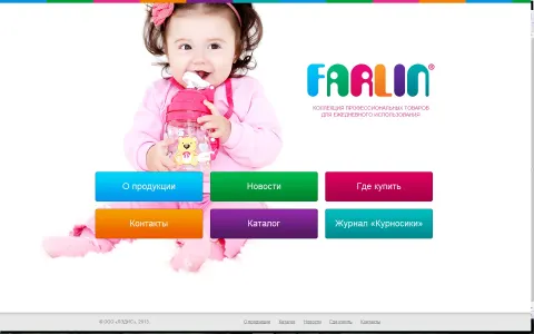
ventopt.by - air conditioning and ventilation systems, installation systems
Type of work: Design, layout, CMS integration
Development of a bright and interesting design for the website of "SVZh-klimat", a company specialising in the sale of equipment for installing ventilation and air conditioning systems.
SVZh-klimat, the company behind ventopt.by, sells equipment for installing ventilation and air conditioning systems. This is a professional market: its customers are mostly installers, contractors and engineering companies who build and service systems in apartments, offices, shops and production facilities. They do not need persuasion about why ventilation matters - they need to find the right component quickly, check its parameters and order it in the necessary quantity, often for a project that has to be finished on a tight schedule.
The brief for the design was unusual for a technical supplier: it was to be bright and interesting. Most wholesale sites for engineering equipment look grey and interchangeable, and a memorable design helps a supplier stand out among them and be remembered the next time an installer needs parts. At the same time brightness could not come at the cost of usability, so the structure of the site remains strictly practical - equipment for ventilation and for air conditioning is separated, product groups follow the logic of installation, and contacts for orders are easy to reach.
We created the design, made the layout and integrated the site into a CMS. The search phrases the site addresses - ventilation systems, ventilation installation, air conditioning installation, indoor ventilation - reflect the language of the people who do this work every day. The CMS allows the company to keep a large and changing range of components up to date without outside help.
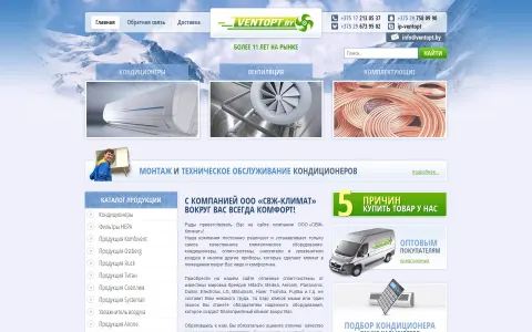
Turbi.by car house - purchase, leasing and sale of vehicles
Type of work: Design, layout, CMS integration
A pleasant and concise design for the website of a company providing various transport related services (leasing, sale, buyout, etc.)
Turbi is a Minsk car house that offers several transport services at once: buying cars, selling them, leasing and car buyout. Each of these services answers a different situation in a person's life. Someone wants to sell a car quickly and without the trouble of private ads, someone needs a car for a business but prefers leasing to paying the full price, someone is looking for a reliable used car with a clear history. The site had to show all these options without mixing them up, so that every visitor could find their own scenario in a few seconds.
The brief for the design was to be pleasant and concise, and in this field that is a practical choice rather than a matter of taste. Car dealers' websites are often overloaded with banners and promises, and a calm, tidy design immediately sets a company apart as one that does business carefully. Each service has its own clear entry point, the conditions are explained in plain language, and the way to get in touch is never far away, because the next step after reading is almost always a phone call or a request for an evaluation.
We developed the design, made the layout and integrated the site into a CMS. The search phrases it answers - buying a car, selling a car, leasing, car buyout in Minsk, car house in Minsk, transport services - correspond one to one to the services of the company, which makes it easy for search engines and for people to understand what Turbi does. The CMS lets the car house publish cars and update conditions on its own.
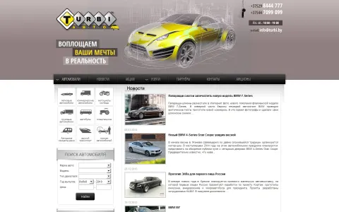
tov.by online shop - modern, affordable, interesting furniture
Type of work: Website redesign
Development of a new website design - interesting, clear and concise.
tov.by is an online furniture shop that sells modern and affordable furniture: tables, chairs, sofas, wardrobes and other pieces for the home. Furniture is one of the hardest things to buy online. A buyer cannot sit on a sofa or open a wardrobe door through a screen, so they rely on photographs, dimensions and descriptions much more than in most other categories, and they hesitate longer before ordering something large and expensive that has to fit into a real room.
The project was a redesign: the shop already existed, and we developed a new design for it that would be interesting, clear and concise. The goal was to let the furniture itself be the main thing on the page. A calm layout with plenty of space gives room to large product photos, the main categories - tables, chairs, sofas, wardrobes - are visible at once, and the information a furniture buyer checks before ordering, such as size, materials and colour, has a fixed and predictable place on every product page. When a design is consistent, a buyer quickly learns where to look and spends their attention on choosing rather than on searching.
The search phrases the shop works with - online furniture shop, furniture in Minsk, buy a sofa, buy a table, chairs and tables in Minsk, buy furniture in Minsk - show that the audience is local and ready to buy. A clear redesign helps turn that readiness into an order instead of a long comparison across many other furniture sites.
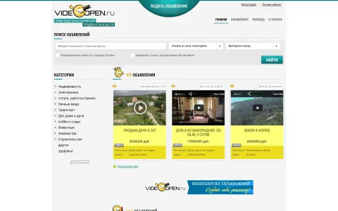
videoopen.ru - a video board of free classified ads on the internet
Type of work: Design, layout, CMS integration
Development of a clear design, layout and CMS integration for an original project - a video board of free classified ads.
videoopen.ru was an original idea: a board of free classified ads where an ad is a video rather than a few lines of text and a couple of photos. A short video shows things that a text ad cannot - a car with its engine running, an apartment walked through room by room, a device that actually turns on and works. For the buyer this saves trips to view things that turn out to be different from the description, and for the seller it is a way to stand out among thousands of similar ads.
Because the format was new, the design had to be clear above all. A visitor who arrives at such a site for the first time needs to understand within seconds how it differs from the usual classified boards, how to watch ads and how to post their own. We kept the interface simple: ads are presented through their video previews with the essential information next to them - category, price, location - and the path to posting an ad is short and visible from any page, because a board of ads lives only as long as people keep adding new ones.
We created the design, made the layout and integrated the site into a CMS. The search phrases the site was built for - video ad, ads in Minsk, post an ad, video classifieds board, classifieds website - combine the familiar language of classified ads with the new video format. The CMS handles the publication and moderation of ads, which is the core of any ad board.
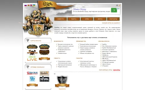
gamepay.by gaming portal - accepting payments for online games
Type of work: Design, layout, CMS integration
Creation of a neat and concise design for a website that accepts payments for online games.
gamepay.by is a gaming portal that accepts payments for online games. Players often need to top up an account, buy in-game currency or pay for a subscription, and not every game offers a convenient local way to do it. A payment service in this niche stands between the player and the game, so the main thing it has to earn is trust: a person is handing over money and expects it to reach the right account quickly and without surprises.
The brief for the design was to be neat and concise, which suits a payment service well. A tidy interface with clear steps looks reliable, and reliability is exactly what people look for when they pay. The most important path on the site - choosing a game, entering the account details, choosing the amount and paying - had to be short and impossible to misunderstand, with every step clearly labelled. Information on how payment works and answers to common questions sit next to this path, because a first-time user usually wants to read a little before trusting a new service with money.
We created the design, made the layout and integrated the site into a CMS. The search phrases the site was built for - online games, play online, pay for a game, payment for online games, how to pay for a game, internet payments - show two types of visitors: people interested in games in general and people who already have a concrete question about payment. The design serves both, and the CMS lets the portal add new games and update instructions on its own.
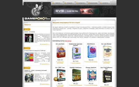
Development and creation of game bots by gamerobot.biz
Type of work: Design development, layout, CMS integration
Creation of a simple and clear website for a team of specialists developing and selling bots for games and other fields of activity.
gamerobot.biz belongs to a team of specialists who develop and sell bots - programs that automate repetitive actions in online games and in other fields of activity. In games such a bot can farm resources, complete routine quests or collect daily bonuses while the player is away; outside games, similar tools automate monotonous work with websites and services. The audience is technically curious but not necessarily made up of programmers: many buyers simply want to save time and need to understand what a bot does before they pay for it.
The client asked for a simple and clear website, and the brief shaped the whole design. A store of software products for a niche audience does not need decorative effects; it needs a clear explanation of each product - what it automates, in which game or service it works, what it costs and how to get it after payment. The structure was planned so that the catalog of bots is the centre of the site, the description of the team's custom development is easy to find for those who need a bot made to order, and the way to contact the developers is always close at hand.
We developed the design, made the layout and integrated the site into a CMS, so that the team can add new bots and update descriptions as their products change. The search phrases the site was built for - bot, game bots, bots for online games, bonus in an online game, buy a bot - show that the audience arrives already knowing what it wants and is looking for a reliable seller.
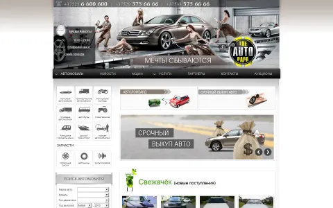
autopapa.by car house - buyout and sale of vehicles
Type of work: Design, layout, CMS integration
Development of a stylish website design for a car house engaged in the sale and buyout of vehicles of various modifications and brands.
autopapa.by is a Minsk car house that buys and sells vehicles of many brands and modifications, from passenger cars to trucks. Its business has two sides that meet on one website. On the one hand there are people who want to sell a car quickly and for a fair price, without the time and risk of a private sale; on the other there are buyers looking for a vehicle that has already been checked by a dealer. Both groups arrive with a practical question, and the site had to answer it immediately: how much will I get for my car, and what is available to buy right now.
The brief asked for a stylish design. In a market where many car dealers have similar, cluttered websites, a distinctive and well-made design is itself an argument - it suggests that the company is established and careful in its work. At the same time style was not allowed to get in the way of the two main tasks. The idea was to give the buyout service and the car catalog separate, clearly marked paths from the very first screen, and to keep the request for an evaluation short, because a person who has decided to sell a car usually wants an answer the same day.
We developed the design, made the layout and integrated the site into a CMS, which lets the car house publish cars and update offers on its own. The search phrases the site was built for - car house in Minsk, car sale, car buyout, sell a car, trucks, passenger cars, vehicle buyout - mirror the two sides of the business and the wide range of vehicles it works with.
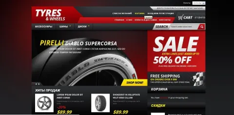
Online shop selling tyres, wheels and car accessories
Type of work: Online shop selling tyres
Have you ever seen anything like this? No? That is because this site was developed by our specialists. A unique design and beautiful banners - everything so that every visitor becomes a customer.
This online shop sells tyres, wheels and car accessories, and our part of the project was its design and the advertising banners. Tyres are a seasonal and highly competitive product. Twice a year, before winter and before summer, thousands of drivers search for the same things at the same time - summer tyres, winter tyres, wheels of the right size - and compare prices across many shops. In such a market a store has only a few seconds to show that it has what the driver needs and that it is worth buying here rather than in the next tab.
That is why the banners were not decoration but a working tool. Each one had to carry a clear message - a season, an offer, a type of product - that a visitor understands at a glance, and to lead directly to the relevant part of the catalog. The design of the shop itself was made unique so that it would not look like the dozens of template tyre stores, while the catalog follows the way drivers actually choose tyres: by season, by size and by brand, with wheels and accessories as separate sections.
The search phrases the shop works with - tyre sale, wheel sale, buy tyres, summer tyres, winter tyres, online tyre and wheel shop - show that the buyers arrive with a clear intention to purchase. The goal of the design and the banners was simple and stated in our brief: every visitor should become a customer. A clear seasonal message and a catalog that matches the buyer's way of thinking are the best tools for that.
A simple and useful website for true travellers and tourists
Type of work: Building a website for travellers
We developed a simple and beautiful design for people who love to travel. Everything is simple, clear and understandable.
This website was made for people who love to travel and broaden their horizons. Its subject is everything that surrounds a trip rather than one particular destination: tickets, the road itself, the travel plan, the things worth packing and the many small pieces of advice that experienced travellers share with each other. Such information is scattered across forums, booking sites and personal blogs, and the idea of the project was to collect it in a simple and clear form in one place.
Our task was to create the site for travellers and design it, and the brief was short: simple and beautiful. For a practical guide simplicity is the main quality. A person preparing for a journey wants to find a concrete answer - how to get somewhere, how to travel cheaper, what not to forget - and a clean layout with clear sections and readable text helps them get it without distraction. The idea was to organise the material around the stages of a trip, from planning and buying tickets to the road and the stay, so that a reader can follow the site in the same order as their own preparations.
The search phrases the site was built for - travel, tickets, how to get there, cheap travel, things for travel, information for tourists, holidays, holiday planning - describe a reader who is already thinking about a trip and is looking for help to organise it. A site that answers these questions clearly becomes a place they return to before every new journey.
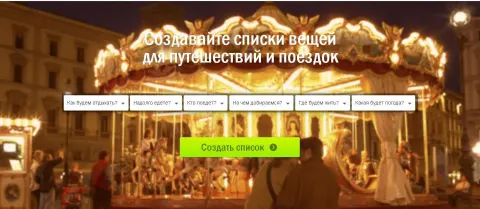
SpectrumSat - services of a reliable internet provider
Type of work: Design and layout of an internet provider website
We developed the design as well as the website itself for an internet and satellite television provider. The site has a standard structure and a homely design.
SpectrumSat provides two kinds of services at home: internet access and satellite television, including its installation. Both are things people usually think about only when they move house, when the old provider disappoints them or when they buy a country house without a cable connection. At that moment they search for a provider, compare a few options and choose quickly, so the website of a provider has to make three things obvious: what services are offered, where they are available and how to get connected.
We developed the design and built the website itself. The structure is deliberately standard - the services, the conditions and prices, the connection process, help and contacts - because people who visit a provider's site are not looking for surprises. They expect to find information in the usual places, and a familiar structure lets them do it without effort. The design, on the other hand, was made homely and warm. Internet and television are services for the home, for family evenings and everyday life, and a friendly visual style suits them better than the cold technical look that many providers choose.
The search phrases the site was built for - internet, get internet, internet provider, internet provider services, satellite television, install satellite TV - show a visitor at the moment of decision. A clear standard structure combined with a pleasant design helps such a visitor understand the offer quickly and leave a request rather than continue the search on another site.
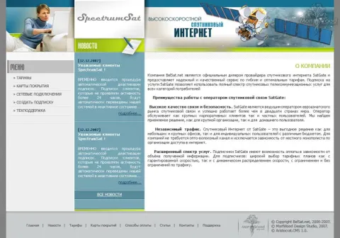
YourClassmates - a social network for finding new friends and chatting
Type of work: Design development for a social network
A great many social networks are appearing these days, and we too recently received an order for yet another social network. Our client ordered a social network aimed at the USA.
YourClassmates is a social network for finding new friends and chatting online, ordered by a client who aimed it at an audience in the USA. New social networks appear all the time, and each of them faces the same difficulty: people already spend their time on large, established platforms, so a new network has to offer a clear reason to join and make the first minutes after registration pleasant enough that the user comes back the next day.
Our task was the design of the network. A social network is used for hours, not seconds, so the interface had to be comfortable for long sessions: the profile, the list of friends, messages and the search for new acquaintances needed to be easy to reach from anywhere, without the user having to remember where things are. Since the audience was American, the design followed the habits of users who are used to the conventions of the leading social platforms of that market, so that a newcomer would feel at home immediately instead of learning a new logic. The registration was meant to be short, because every extra field at the start loses part of the people who were ready to try the network.
The search phrases the project was built around - social networks, communication, finding friends, chatting online, registration in a social network, social network for the USA, online communication - describe exactly this situation: a person looking for new people to talk to and a place where starting a conversation is easy.
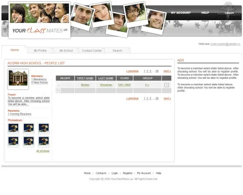
Online shop of metal products and metalware
Type of work: design of an online shop selling metal products
We developed yet another design for an online shop selling metal products.
This project is the design of an online shop that sells a variety of technical metal products and metalware. Its buyers are mostly businesses and professionals - construction and repair companies, workshops, manufacturers, maintenance departments - who purchase metal goods regularly and often in large quantities. For them the shop is a working tool: they know what they need, they compare specifications and prices, and they want to place an order and move on to the rest of their day.
A metal products catalog is large and technical. The same kind of item can exist in many sizes, grades and finishes, and a buyer needs to see these parameters clearly to pick the right one. The design therefore had to bring order to a big range: a clear hierarchy of categories, product cards where the technical characteristics are easy to scan, and prices and availability that do not have to be searched for. Wholesale buyers also need to understand the terms for bulk orders, so information about wholesale purchases was meant to be easy to find rather than hidden in the footer.
The search phrases the shop was designed around - metal products, metalware, metal, metal wholesale, metal products wholesale, buy metal products - show that a large part of the audience is interested in buying in volume. A clear, practical design that respects the buyer's time is the best way to win this kind of customer, because a business that finds a convenient supplier tends to stay with it for years.
Online shop selling first aid kits and medicines
Type of work: design of an online shop selling first aid kits
A brand new wave has taken over the market: first aid kits are now being bought very actively online too. We also keep up with the times and created the design of an online shop selling medicines and first aid kits.
This online shop sells first aid kits and the medicines that go into them, with a particular focus on car first aid kits. In many countries a driver is required to carry a complete first aid kit, and its contents have an expiry date, so the purchase comes back regularly: before a technical inspection, after a kit has been used, or simply when the medicines inside have expired. At the time we worked on the project, buying such things online was a new and fast-growing habit, and the shop was built to meet it.
Our task was the design of the shop. A store of first aid kits has to inspire trust above all, because it deals with health and with goods whose composition matters. The design was meant to be clean and orderly, so that a visitor immediately understands what is on offer: ready-made kits for cars, for home and for work, and separately the medicines and items to replenish a kit that is already in use. A buyer of a car kit usually wants to know only two things - that the kit meets the requirements and how much it costs - so this information had to be visible without extra clicks.
The search phrases the shop was designed around - first aid kit, buy a first aid kit, car first aid kits, sale of first aid kits, sale of medicines, buy a car first aid kit - show that most visitors arrive with a concrete, practical need. A clear and calm design helps them fulfil it in a few minutes and come back the next time their kit needs to be renewed.
Books, magazines, calendars and other printed products online
Type of work: design for an online bookstore
A fairly simple task for our team of specialists. We made simple but convenient functionality and placed a girl reading a book in the site header.
This is an online bookstore that sells books, magazines, calendars and other printed products. For our team it was a fairly simple task, and we deliberately kept the result simple: an online shop where the functionality is clear and convenient and where nothing stands between the reader and the book. The one strong visual accent is in the header of the site - a girl reading a book. It sets the mood of the whole store in a single image and reminds the visitor why they came: not to browse a catalog, but to find something to read.
Bookstores have a special challenge: the range is enormous, and buyers come with very different intentions. Some know the exact title and author and want to find it in seconds; others just want something new to read and need help choosing; others again are looking for a magazine or a calendar as a gift. Clear navigation was therefore the core of the design, so that categories of printed products are easy to tell apart, and the path from the home page to the book card and the order is short.
The search phrases the store was designed for - books, buy a book, books online, buy a magazine, where to buy books, bookstore, online bookstore - include both direct purchase requests and the question "where to buy", which people ask when they are not yet loyal to any shop. A simple and convenient design is a good answer to that question: a reader who found the right book easily once is likely to come back for the next one.
Online shop selling piercing jewellery
Type of work: design and layout of a website selling piercing jewellery
In red tones we created the design and the online shop itself selling piercing jewellery. At the top of the site we placed an attractive girl with a piercing.
This online shop sells piercing jewellery: rings, barbells, earrings, studs and other pieces for ear, nose, eyebrow and tongue piercings. Its audience is young and visually minded, and they choose jewellery the way they choose clothes - by style, colour and how it will look on them. For such buyers the look of the shop matters as much as the range: a store that feels dull or clinical is unlikely to convince them that its jewellery is stylish.
We created the design and built the online shop itself, and we chose red as the main colour. Red is bold and expressive, it suits the energy of piercing culture and makes the shop instantly recognisable. At the top of the site we placed an attractive girl with a piercing, so that a visitor sees the product in use from the very first moment - not as a small object on a white background, but as part of someone's style. Below this emotional first screen, the catalog had to be practical: piercing jewellery differs by the place of the piercing, the type of piece, the size and the material, and a buyer needs to filter by these parameters to find something that will actually fit.
The search phrases the shop was built for - piercing, piercing jewellery, buy earrings for piercing, ear piercing, nose piercing, eyebrow piercing, tongue piercing, rings, barbells - follow exactly this logic, by place and by type of jewellery, and the structure of the catalog was designed to match them.
Online shop of laptops and computer equipment
Type of work: design and layout of an online laptop shop
We developed the design and the site in red tones. The result was a stylish online shop selling laptops.
This is an online shop of laptops, tablets and computer accessories. Electronics is one of the most competitive categories in online retail: the same models are sold by dozens of stores, and buyers compare prices and specifications across several tabs before deciding. A shop in this market cannot win only by price, so the impression it makes and the ease of choosing in it become important arguments.
We developed the design and built the site, and we made it in red tones. Most electronics stores use cold blue and grey palettes, so a confident red immediately sets this shop apart and makes it memorable. The result was a stylish shop - and style matters for this product, because a laptop or a tablet is not only a tool but also a personal item that people carry everywhere and choose partly by its look. At the same time a buyer of a laptop compares concrete parameters - processor, memory, screen size, weight and battery life - so the catalog had to make these specifications easy to scan and compare, with laptops, tablets and accessories in separate, clearly marked sections.
The search phrases the shop was built for - laptop, buy a laptop, online laptop shop, tablet, buy a tablet, computer equipment shop, laptop sale - reflect a buyer who is close to a decision. A stylish design that stands out from the grey mass of electronics stores, combined with a catalog that makes comparing models easy, gives such a buyer a reason to finish the purchase here.
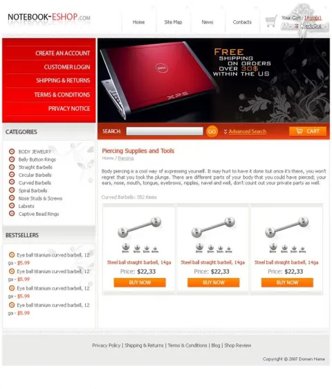
Stopex - a website for protecting electronic payments
Type of work: website and design development
We developed an attractive design in neutral colours for a website protecting electronic payments. We also built the structure of the site itself.
Stopex is a website devoted to protecting electronic payments and online transactions. Paying online has become an everyday habit, but so have the risks that come with it - fraudulent sites, stolen card details, unauthorised charges. People who look for payment protection usually do so either because something has already gone wrong or because they are about to make an important transaction and want to be sure it is safe. In both cases they are cautious and need to trust the site before they even read its offer.
We developed the website and its design. For a security service the visual tone is part of the message, so we chose neutral colours: a calm, restrained palette looks serious and reliable, and it does not distract from the information. Bright effects and aggressive advertising would have the opposite effect here - they are exactly what a cautious visitor associates with suspicious websites. We also built the structure of the site, so that the explanation of how the protection works, who it is for and how to start using it follows a clear, logical order and answers the visitor's questions before they arise.
The search phrases the site was designed for - electronic payments, internet payments, protection of electronic payments, secure internet payments, securing online payments - describe a person who wants to pay online without fear. A neutral, orderly design and a structure that explains rather than pushes are the right way to speak to such a person.
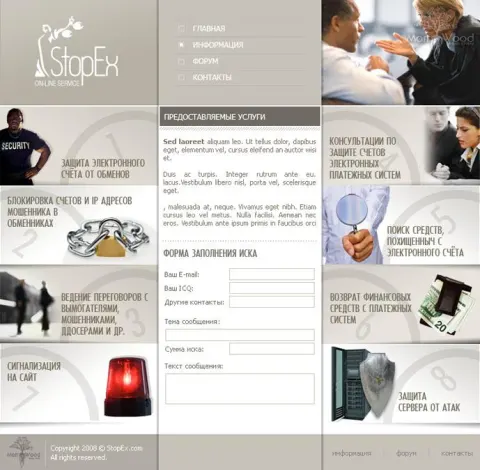
Reliable and high quality ventilation system installation services
Type of work: development and design of a corporate website
Our team created the design and built the website for a company that installs ventilation systems. Since factories and plants are the main consumers of their services, we also depicted a plant in the site header.
This corporate website belongs to a company that installs ventilation and air conditioning systems. Its main customers are factories and plants, and that defines the whole project. An industrial client chooses an installation contractor in a completely different way from a private buyer: the decision is made by engineers and managers, the systems are large and complex, and what matters is experience with similar facilities, reliability and the ability to deliver a durable result on schedule.
Our team created the design and built the website. Since factories and plants are the main consumers of the company's services, we depicted a plant in the site header. This image tells an industrial visitor at once that the company works in their world - with production halls, workshops and technological processes that require serious ventilation, not with apartments and small offices. Below the header, the corporate site presents the company and its services in a structured way: installation of ventilation systems, installation of air conditioning systems and the related services, with the emphasis on modern, reliable and long-lasting solutions, as stated in the company's own description.
The search phrases the site was built for - ventilation, ventilation systems, installation of ventilation systems, installation of air conditioning systems, installation services - are those that technical specialists use when looking for a contractor. A corporate design that speaks the language of industry and a clear presentation of services help the company be taken seriously by exactly this audience.
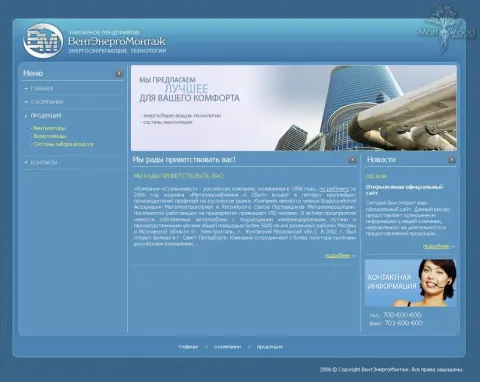
Online shop of jewellery and ornaments
Type of work: design and layout of an online jewellery shop
We developed an online jewellery shop with chic and sparkle. In the site header we placed a beautiful ring with precious metals.
go4buys is an online jewellery shop that sells earrings, rings, bracelets, wedding rings and other precious items. Jewellery is a purchase driven by emotion and by trust in equal measure. People buy it for themselves as a small celebration, for a loved one as a meaningful gift, or for a wedding, one of the most important occasions in life. In each case they want to feel that the piece is special, and at the same time they need to be sure that the shop is reliable, because the items are valuable and the buyer cannot hold them before paying.
We designed the shop and built it, and we wanted it to have chic and sparkle. In the site header we placed a beautiful ring with precious metals, so that the first thing a visitor sees is the beauty of a real piece of jewellery, shown large and in detail. The rest of the design follows the same idea: generous space around the products, an elegant presentation and a calm background that lets the shine of the metal and stones stand out. Behind this elegant surface, the catalog was meant to be easy to use - earrings, rings, bracelets and wedding rings in their own sections, so that a buyer with a specific occasion in mind finds the right category immediately.
The search phrases the shop was built for - jewellery, online shop with jewellery, earrings, buy earrings, ring, buy a ring, wedding rings, bracelets, precious items - mix the general wish to look at beautiful things with concrete purchase intentions, and the design was made to serve both.
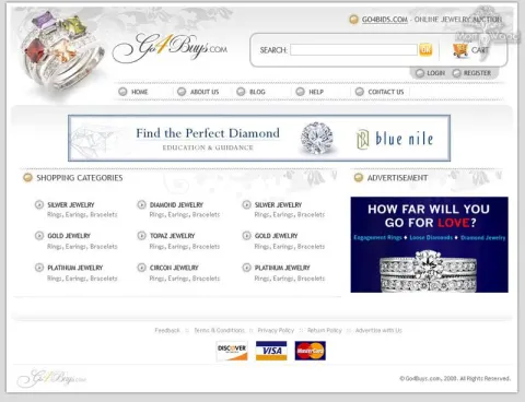
A website with reviews of various medicines and drugs
Type of work: design of a website with medicine reviews
We created a decent design for a website that collects medicine reviews. The main task was to depict nature with a doctor against its background. This symbolises the natural source of medicines.
The site collects detailed descriptions and reviews of medicines and drugs: their properties, the cases in which they are used and the ways they are taken. People come to such a resource at sensitive moments - when a doctor has prescribed something unfamiliar, when they want to understand the instructions in a package, or when they compare a medicine with its alternatives and look at its cost. In these moments a visitor needs calm and clarity, not advertising noise, and the design had to create exactly that atmosphere.
The central visual idea of the project was set by the client: to depict nature with a doctor against its background. This image carries a simple message - many medicines have a natural origin, and medicine works together with nature rather than against it. It also softens the subject: instead of the cold look of a pharmacy counter, the visitor sees greenery and a figure that suggests professional care. Below the header the structure had to stay practical, because the main value of the site is its catalog of drug descriptions, and a person looking for a specific medicine wants to reach its card in a few steps and read the information without distractions.
The search phrases the site was designed for - medicines, drugs, drug descriptions, medicine reviews, drug catalogue, buy a medicine, cost of medicines - show that visitors come both to learn and to prepare for a purchase. A trustworthy, natural design supports both intentions and makes the site a place people return to whenever a new prescription raises questions.
An excellent website for a real estate agent
Type of work: design for a real estate agent website
We developed a unique design for the website of a real estate agent. Unfortunately the client did not like everything, and some parts had to be left in their original form.
This website was made for a real estate agent who sells and buys property - flats, houses and plots of land - and also works with house construction. For an individual agent a website plays a double role. It is a catalog of current properties, where buyers can browse offers before calling, and at the same time it is the agent's personal presentation: a buyer or seller choosing an agent wants to see who this person is, how they work and whether they can be trusted with one of the largest transactions in life.
We developed a unique design for the agent's website. The structure was planned around these two roles: the properties - flats, houses and plots, each with its own section - and the information about the agent and their services, so that a visitor can go from an interesting listing to the person behind it and back without effort. Property listings live by photographs and key facts - location, area, price - and the design was meant to give them room and a consistent layout.
Not every idea of the design made it into the final site. The client did not like everything we proposed, and some parts of the site had to be left in their original form. This is a normal part of working with clients: the website belongs to the person who uses it every day, and our job is to offer the best solution we can and respect the client's final decision. The search phrases the site addresses - real estate agent, real estate agency, houses, flats, buy a flat, buy a plot, house construction - show the range of the agent's work.
Online shop selling laptop components
Type of work: design for an online shop selling laptop parts
We developed a simple and convenient online shop. The main task was to create a quick menu for fast product search.
This online shop sells components for laptops: batteries, chargers, keyboards and other spare parts for many brands and models. Its customers are people whose laptop has a specific problem - the battery no longer holds a charge, the charger has broken, a key has stopped working - and who want to fix it quickly instead of buying a new computer. They usually know their laptop's brand and often its model, and their search is very precise: a battery for a particular Asus or Acer, a charger with the right connector, a keyboard with the right layout.
We developed a simple and convenient online shop, and the main task was to create a quick menu for fast product search. In a store of spare parts the range is enormous and fragmented: the same type of component exists in dozens of versions for different models, and a buyer who has to browse a long list will give up. The quick menu was meant to lead the visitor from the type of component and the laptop brand to the right product in a few clicks, so that the search for a part takes seconds rather than minutes.
The search phrases the shop was built for - laptop charger, laptop components, asus battery, acer battery, laptop spare parts, replace a laptop keyboard - show this precision clearly. They name brands and concrete parts, and the closer the shop's navigation follows such queries, the more likely it is that a visitor arriving from a search engine finds exactly what they need and orders it straight away.
Novatelecom - official dealer of the Life company
Type of work: design development for the website of a Life dealer
The client asked us to create an online shop with the company's logo and its branding. We did all of that. At the top of the site we placed an attractive girl, an employee of this dealer.
Novatelecom is an official dealer of life:), one of the mobile operators in Belarus, and provides mobile communication services on its behalf. A dealer's website is in a special position: it sells the services and products of a large, well-known brand, so it has to look like part of that brand's family, while still being the dealer's own shop with its own offers and its own people. Visitors need to recognise the operator they trust and, at the same time, understand that they can get connected and buy here.
The client asked us to create an online shop with the company's logo and its branding, and we did all of that. The design follows the corporate style of the operator, so that a customer who knows life:) feels on familiar ground from the first second. At the top of the site we placed an attractive girl, an employee of this dealer. This detail gives the shop a human face: instead of an anonymous corporate banner, the visitor sees a real person from the team, which makes the dealer feel closer and more approachable than the operator's head office.
The search phrases the site was built for - mobile operator, mobile communication operator, mobile communication in Belarus, Novatelecom, life, mobile communication services - combine the name of the operator with the name of the dealer. Keeping both in the design and the content helps people who search for the operator find an official place to buy, and helps those who already know Novatelecom find its online shop.
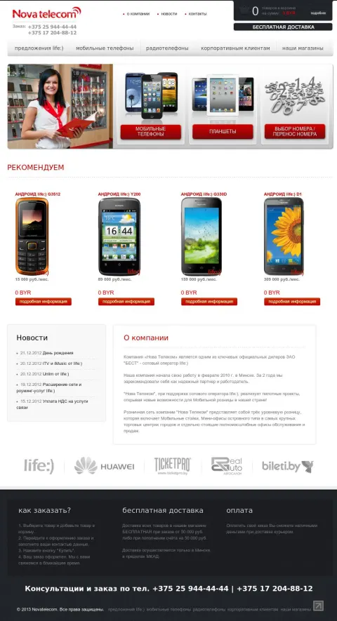
Minimoto.by - online shop selling minibikes and ATVs
Type of work: design development for an online shop selling minibikes
We were given a very difficult task. We had to create an online shop that would sell minibikes. The name of every section had to be marked with its own matching icon. The task was not an easy one, but in the end we produced a good design and convenient site functionality.
Minimoto.by is an online shop of minibikes, ATVs, motorcycles and other motorcycle equipment in Minsk, with a large part of the range intended for children and teenagers. Minibikes and children's ATVs are a special category: they are often bought by parents, not by the riders themselves, and these parents care about size, safety and the right age much more than about engine power. At the same time the shop also serves adult riders, so its catalog has to speak to very different buyers.
We were given a difficult task: to create an online shop for minibikes in which the name of every section is marked with its own matching icon. With a wide range of categories - minibikes, ATVs, motorcycles, children's equipment, gear - icons are not decoration but a navigation tool. A child can recognise a minibike or a quad at a glance, and a parent scanning the menu finds the right section faster by image than by reading every word. The difficulty lay in making a coherent set of icons that are recognisable, consistent in style and clear even at small sizes. The task was not easy, but in the end we produced a good design and convenient site functionality.
The search phrases the shop was built for - minibike, buy a minibike, ATV, buy an ATV, children's motorcycle equipment, children's ATV, motorcycle equipment in Minsk - show both sides of its audience, and the icon-based menu helps both of them find their way.
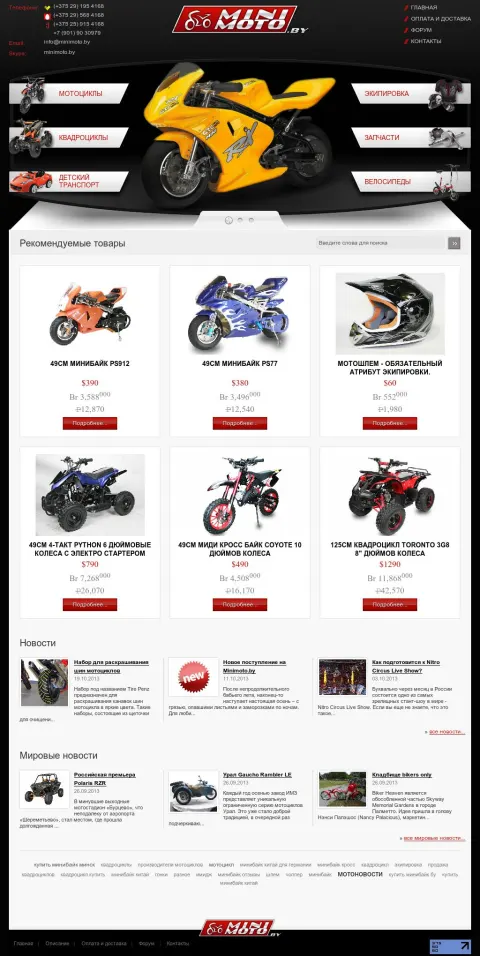
Online shop of pet supplies for household favourites
Type of work: design of an online pet supplies shop
Our client ordered an interesting project to create a design for an online pet supplies shop. The most important thing the client wanted to see was that the site is associated only with positive emotions and household favourites. We handled the task and the client was very pleased.
This online shop sells pet supplies for household favourites: food, vitamins, toys, clothing, cages, medicines and other things that cats, dogs, birds and other pets need. Buying for a pet is an emotional activity. Owners treat their animals as members of the family, they enjoy choosing a new toy or a warm jacket, and they worry when they buy food or vitamins, because the health of the animal depends on it.
Our client ordered an interesting project - the design of an online pet supplies shop - and was very clear about the most important requirement: the site should be associated only with positive emotions and with household favourites. That meant warmth instead of the neutral look of a typical online store: friendly colours, images of animals that make people smile, and a light, cheerful mood on every page. At the same time the shop had to remain practical. Owners usually shop for a particular animal, so the catalog was meant to let them start from the type of pet and then go to the kind of product - food, care, toys, clothing, accommodation - without wading through goods for other animals.
We handled the task, and the client was very pleased with the result. The search phrases the shop was built for - pet supplies, goods for animals, pet shop, online shop with pet supplies, animal food, animal cages, vitamins for animals - cover both everyday needs and occasional purchases, and a design built on positive emotions makes even routine shopping for pet food a small pleasure.
Realauto.by - a convenient and functional website of a car dealership in Minsk
Type of work: Design development for a car dealership website
We developed a pleasant design and convenient functionality for a car dealership website. The main task was to create an unobtrusive design and a convenient menu for finding the right car.
Realauto.by is the website of a car dealership in Minsk that sells cars in stock and to order, including used cars and cars in instalments. People who come to a dealership site usually already have a rough idea of what they want - a budget, a type of car, sometimes a specific make and model - and their main goal is to find out quickly whether this dealer has a suitable car and on what terms. A site that makes them dig through banners and long texts loses them to the next dealer in the search results.
We developed a pleasant design and convenient functionality for the dealership. The main task was to create an unobtrusive design and a convenient menu for finding the right car. Unobtrusive here means that the cars are the main content: the design stays in the background, does not compete with photos of vehicles and does not distract with unnecessary effects. The menu was meant to let a visitor narrow the choice step by step - cars in stock or to order, new or used, by make and price - so that the path from the home page to a suitable car is short and clear.
The search phrases the site was built for - car dealership, car house, buy a car, car in instalments, used car, car to order, car dealership in Minsk - describe people who are close to a purchase and are comparing offers. A calm design with a convenient search lets such visitors see the dealership's range quickly and contact it while their interest is at its highest.
555km.by - finding drivers and travel companions
Type of work: development of the design and the site engine
We developed a beautiful and simple website that brings drivers and travel companions together. Are you a driver and want to save on the road? Then you can find a companion through the site. In the same way a companion can find a car and get to the right place more cheaply. The main thing in the design, as requested, is simplicity and convenience. We embodied all the client's wishes in a unique design and site engine. The result is a really solid website that is convenient and looks great.
The idea of 555km.by is old and simple: a driver who has free seats in the car shares the cost of the trip with passengers going the same way. For the driver this means cheaper fuel and company on a long road, for the passenger a faster and often cheaper journey than by bus or train. A service of this kind works only when both sides find each other easily, so the whole site is built around search - by the starting point, the destination and the date.
Because the site connects strangers, trust matters as much as convenience. A passenger wants to know who is driving and when exactly the car leaves; a driver wants to know who will sit in the car. The design gives each trip a clear card with the route, the time and the number of seats, so that a decision can be made quickly and without misunderstandings.
We built both the design and the engine of the site, so the logic of publishing and finding trips was made exactly for this task rather than adapted from a generic template.
DDOS Protection - protection against external attacks on websites
Type of work: refinement of the company design
We complemented and emphasised the design of a company that protects websites against various DDos attacks. A beautiful site logo was developed and the menu was improved.
DDOS Protection is a company that protects websites against DDoS attacks and other external attacks. A DDoS attack floods a website with so much traffic that real visitors can no longer reach it, and for an online store, a payment service or a news site even a short outage means lost money and lost trust. Clients of such a company usually come either after an attack has already hit them or because they fear one, so they need to understand quickly what the protection does and how fast it can be put in place.
This project was not a design from scratch but a refinement of the company's existing design. We complemented and emphasised the visual style the company already had, rather than replacing it - for an established business this is often the wiser path, because customers already recognise its look. Within this work we developed a new, more expressive logo for the site and improved the menu. The logo gives a security company a stronger and more memorable identity, and a clearer menu helps a worried visitor find the information they need without delay: what kinds of attacks are covered, how the protection is connected, what it costs and how to get in touch.
The search phrases the site works with - website protection, protecting a site against attacks, site protection software, DDoS attacks, protection against DDoS attacks - describe exactly that moment of concern. A recognisable logo and a menu that leads straight to answers help the company turn this concern into a request for protection.
Bestbarbell.com - online shop of piercing jewellery
Type of work: online shop design
Development of a design for an online shop selling piercing jewellery. As the client intended, we placed a woman's navel with a beautiful piercing in the site header.
Bestbarbell.com is an online shop of women's piercing jewellery, with a focus on beautiful and unusual pieces rather than on a basic set of studs and rings. Its customers are women who see a piercing as a part of their personal style, comparable to a carefully chosen accessory, and who look for jewellery that is elegant and feminine. For them the shop is as much a place for inspiration as a place to buy, and the design had to reflect that.
We developed the design of the shop. The central image was the client's own idea: a woman's navel with a beautiful piercing in the header of the site. It is a bold choice, but an honest one - navel jewellery is one of the most popular categories in this field, and showing a real piece on the body tells a visitor more about its size, shine and effect than any product photo on a white background. The image also sets a feminine, slightly sensual tone that runs through the whole shop and distinguishes it from stores that address all audiences at once.
Below the header, the shop follows the way buyers search: by the type of piercing - navel, ear, nose, eyebrow, tongue - and by the type of jewellery - rings, barbells, earrings. The search phrases the shop was built for - piercing, piercing jewellery, buy earrings for piercing, ear piercing, nose piercing, eyebrow piercing, tongue piercing, rings, barbells, earrings - match these two ways of choosing, so that a visitor arriving with a specific idea can find it without effort.
ArtPodiu - beautiful, fashionable and stylish clothing
Type of work: Design of an online shop with fashionable clothing
A simple and convenient design for quality, beautiful and fashionable clothing. Even the site itself carries small notes of beauty and fashion. It is also arranged so that a person can reach any given product very quickly.
ArtPodiu is an online shop of fashionable and stylish clothing and accessories, built around the idea of impeccable style and elegance at good prices. Clothing is one of the most visual categories in online retail: people choose with their eyes first, and a shop that looks dated or careless cannot convince them that it sells fashionable things. At the same time fashion buyers are impatient - they want to see the new collection, find their size and decide quickly.
We designed the shop with a simple and convenient approach, and even the site itself carries small notes of beauty and fashion - delicate details in the layout and typography that echo the world of the catwalk suggested by the shop's name, without overwhelming the clothes. The products remain the main focus; the design frames them like a well-lit shop window frames the garments on display.
The other key requirement was speed of navigation. The site is arranged so that a person can reach any given product very quickly, in just a few clicks from any page. For a clothing store this is essential: buyers often come with a specific idea - a dress, a jacket, an accessory to complete an outfit - and every extra step between that idea and the product page is a chance for them to leave. The search phrases the shop works with - clothing, buy clothing, fashionable clothing, stylish clothing, online shop of clothing and accessories, clothing at good prices - reflect this mix of style and practicality.
Lamur - everything about weddings and preparing for the celebration
Type of work: Design of a wedding themed website
A light, white and pleasant website dedicated to weddings. Since the symbol of this celebration is the colour white, the site was made in the same tones.
Lamur is a website dedicated to weddings: to the bride and groom, to the stages of the celebration and to proper preparation for the big day. Couples who are planning a wedding face a long list of decisions - the date, the venue, the dress, the guests, the order of the day - and most of them are making these decisions for the first time. A site that explains how to organise a wedding step by step becomes a companion through months of preparation, and it needs a mood that matches the occasion.
We designed a light, white and pleasant website. Since the symbol of the wedding celebration is the colour white, the site was made in the same tones: white space, soft accents and a gentle atmosphere that recalls a wedding dress, flowers and festive table linen. This choice is not only aesthetic. A light design makes long texts about preparation easy to read, keeps attention on the content and creates the calm, joyful mood that couples want to feel while planning, instead of the stress that the long to-do list can cause.
The search phrases the site was built for - wedding, preparing for a wedding, wedding preparations, website about weddings, wedding celebration, how to organise a wedding, stages of a wedding celebration - describe exactly this audience: people at the beginning of an important journey who are looking for guidance. A design that feels like the celebration itself invites them to return as their preparations move forward.
Problemnet.by - the best website about psychology, interpersonal and family relationships
Type of work: Design for a website of Belarusian psychologists
Development of a beautiful and positive design for a website about psychology. The main theme of the design is wellbeing in the family.
Problemnet.by is a website of Belarusian psychologists about psychology, interpersonal and family relationships, wellbeing in the family and answers to other topical questions. People turn to such a site in difficult moments: a conflict with a partner, misunderstandings with children, tension with parents, a feeling that something in the family has gone wrong. They come looking for understanding and practical advice, and the first impression of the site determines whether they will trust it enough to read on.
We developed a beautiful and positive design, and its main theme is wellbeing in the family. This was a deliberate choice. Many psychology websites focus on problems and look heavy or clinical; this one shows the goal instead - a calm, warm family life - and invites the reader to move towards it. A positive visual tone helps a visitor who arrives in a difficult state feel that the situation can be improved and that the people behind the site are on their side. At the same time the design leaves plenty of room for the texts, because the core of the site is its articles and answers, and they need to be comfortable to read even when they are long.
The search phrases the site was built for - psychology of relationships, family relationships, family psychology, wellbeing in the family, general psychology - show an audience that wants to understand and to change something. A design built around the image of a happy family speaks to that hope directly.
Babyworld.by - useful information for mothers and their babies
Type of work: Design of a website for mothers
A new bright and beautiful design for a website for mothers. The main theme of the design is cartoons and babies.
Babyworld.by is a website for mothers that collects the most topical, important and interesting information from the life of babies and their parents: how to care for a newborn, how to raise children, what to expect at each stage of development and how other parents handle everyday situations. Its readers are mostly young mothers, often reading in short pauses between feeding, walks and sleep, and they need answers that are easy to find and pleasant to read.
We created a new bright and beautiful design for the site, and its main theme is cartoons and babies. The cartoon style gives the site a warm, playful character that immediately signals what it is about - the world of small children - and sets it apart from dry medical reference sites. Bright colours and friendly illustrations create a mood of joy and care, which is exactly what parents want to feel when they read about their child, even when the article answers a worrying question.
Behind the playful surface, the site works as a blog for parents, so its structure had to keep a growing number of articles easy to navigate by topic: care, health, development, upbringing. The search phrases the site was built for - child, childcare, how to care for a baby, blog for parents, blog for young mothers, children's blog, how to raise children - show both practical questions and the wish to belong to a community of parents. A bright, kind design answers both.
321.by - a colourful website of a travel company, searching for trips
Type of work: Travel portal website
Redesign of a travel company's design. A very complex and delicate piece of work on creating a colourful and convenient design and functionality.
321.by is the website of a travel company that helps people plan holidays and find trips that are both interesting and good value. A travel portal has to combine two things that do not naturally go together: inspiration and precise search. People come to dream about the sea, mountains and foreign cities, but they also come with a budget, a date and a number of travellers, and they want to see offers that fit these conditions without scrolling through everything else.
The project was a redesign of the company's existing website, and it turned out to be a very complex and delicate piece of work. We had to create a colourful and convenient design and functionality for a site that already had its own users and its own logic. A redesign of a working portal is harder than a design from scratch: everything that people already rely on - searching for tours, browsing destinations, contacting a manager - has to keep working and become easier, while the look of the site changes completely. The colourful style reflects the mood of travel, bright and full of impressions, but the functional part of the redesign was meant to keep the search for trips at the centre, so that a visitor can move from a beautiful picture of a destination to concrete offers in a few steps.
The search phrases the portal was built for - travel, tourism, travel company, website about travel, tour search, good value tours, holidays abroad, interesting trips - mix exactly these two motives, the dream and the practical search, and the new design was made to serve both.
Lapfox - components and accessories for laptops
Type of work: Online shop with laptop accessories
Design of an original website selling components and accessories for laptops. The client wanted the site logo to be a fox. A simple yet elegant design, very convenient for users and pleasing to the eye.
Lapfox is an online shop of components and accessories for laptops: keyboards, batteries, mice, bags and many other parts and add-ons. Its range covers two quite different needs. Some customers come because something has broken and must be replaced - a battery or a keyboard - and they search precisely by model. Others want to make everyday work with a laptop more comfortable - a better mouse, a protective bag - and they browse and compare. The shop had to work well for both kinds of visit.
We designed an original website for the shop. The client wanted the logo of the site to be a fox, which plays on the shop's name and gives it a friendly, memorable character in a category that is usually dry and technical. The rest of the design follows the same balance: simple yet elegant, very convenient for users and pleasing to the eye. Simplicity here means a clear catalog structure - components separated from accessories, each group divided into understandable sections - and a layout that does not distract from the products. Elegance means that even a shop of spare parts can look neat and pleasant, which makes it feel more reliable to a buyer who is about to spend money.
The search phrases the shop was built for - laptops, laptop components, laptop accessories, laptop keyboard, mouse, laptop battery, laptop bags - reflect both the repair-driven and the comfort-driven purchases, and the structure of the catalog follows them closely.
FotoHost.by - the best platform for your photographs
Type of work: Photo hosting website
A simple and light design for a photo hosting website. Everything is simple and easy!
FotoHost.by is a photo hosting service: a place where people can upload their photographs, store them safely and share them through a link. The service answers a simple question that many people ask - where to store photos so that they are not lost when a phone breaks and so that they can be shown to friends without sending dozens of heavy files. Users of a photo hosting service range from casual users with holiday pictures to bloggers and forum members who need to insert images into their posts, and all of them want the same thing: to upload quickly and get a working link.
We created a simple and light design for the service, and the principle behind it fits in a few words: everything is simple and easy. For a photo hosting site this is exactly right. The upload form is the heart of the service and has to be impossible to miss; the photographs themselves are the content, so the design around them stays light and does not compete with the images; and the explanation of how the service works, how safe the storage is and what the user gets after uploading has to be short enough to read in a few seconds. A light background also shows photographs in their true colours.
The search phrases the site was built for - photographs, photos, photo hosting, where to store photos, platform for photos, simple solutions for photo hosting - describe people looking for a reliable and uncomplicated tool, and a simple design is the clearest promise that the tool will be easy to use.
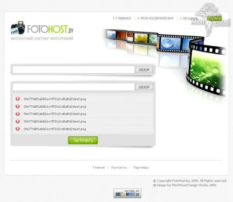
A gothic and captivating website of the band Mourning Srimson
Type of work: Creating the website design for the band Mourning Srimson
A very large and extensive piece of work. The main difficulty was to fit gothic attributes such as crosses and a graveyard organically and beautifully into the design. Despite these attributes, the site turned out rather attractive.
Mourning Srimson is an alternative band, and its website had to be as uncompromising as its music. For bands of this genre a website is part of the artistic image, not just a place for news and concert dates: fans expect to step into the same dark, atmospheric world that they hear in the songs, and a neutral, template-like site would feel like a betrayal of that world.
It was a very large and extensive piece of work. The main difficulty was to fit gothic attributes - crosses, a graveyard and other symbols of the style - into the design organically and beautifully. Such elements are easy to overdo, and then a site turns into a heavy, gloomy collage that is hard to read and unpleasant to use. Our task was to let them create the atmosphere while keeping the site readable and convenient: deep blacks and dark tones for the background, carefully placed gothic details that frame the content rather than bury it, and clear navigation to the sections fans actually use - music, news, concerts, photos and contacts. Despite all these dark attributes, the site turned out rather attractive, and that balance was exactly the goal.
The search phrases the site was built around - gothic, gothic style, music, band, Mourning Srimson, gothic design, black in design - show that the site speaks both to the band's fans and to people interested in the gothic aesthetic itself, and the design was made to satisfy both.
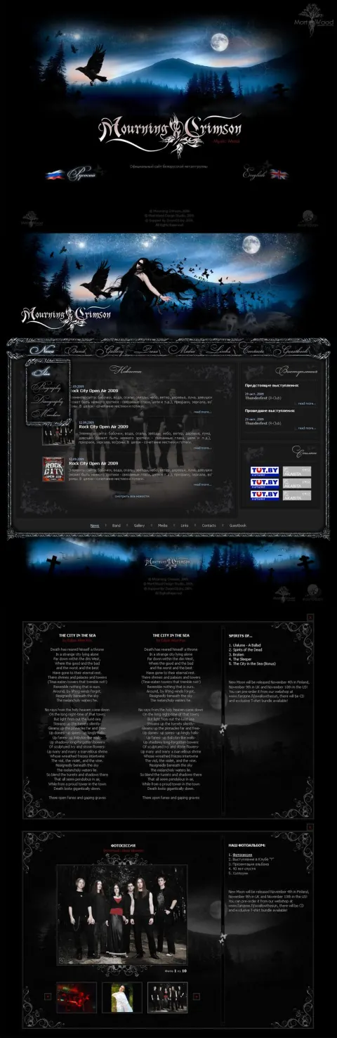
RXCent - sale of medicines online
Type of work: Creating the design for the RXCent online medicine shop
We created a unique design for a foreign website selling medicines online.
RXCent is a foreign online shop that sells medicines and drugs. An online pharmacy is one of the most demanding types of e-commerce. Its customers often buy something they need regularly or urgently, they care about the exact name, dosage and form of a medicine, and above all they need to trust that the shop is genuine and that what arrives in the parcel is exactly what they ordered. A careless or cheap-looking design immediately raises doubts in this field, so the visual impression is part of the shop's credibility.
We created a unique design for the shop. The aim was a clean, professional look that conveys reliability: an orderly layout, calm colours associated with health and care, and clear typography that makes the names and dosages of medicines easy to read. The catalog of an online pharmacy is large and full of similar names, so the design had to make search and navigation the core of the site, with each product page presenting the essential information - the name, the active substance, the form, the dosage and the instructions for use - in a consistent and predictable way.
The search phrases the shop works with - medicines, drugs, buy medicines, buying medicines online, buy drugs online, instructions for medicines - show that visitors come both to buy and to read about how a medicine should be taken. A design that presents this information clearly and calmly serves both needs and helps the shop earn the trust that an online pharmacy cannot do without.
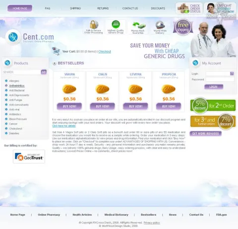
JWLS - legal services online, cargo support
Type of work: Building the JWLS legal services website
We created the design and the website for the legal company JWLS. It provides legal support for a wide variety of cargoes.
JWLS is a legal company that provides legal support for the transport of a wide variety of cargoes. Moving goods, especially across borders, involves contracts with carriers, customs documents, insurance, liability for damage or delay and many other legal questions. When something goes wrong - a load is held at customs, a carrier refuses to pay for damage, documents turn out to be incomplete - a company needs a lawyer who understands both the law and the realities of logistics. JWLS offers exactly this combination, including consultations online.
We created both the design and the website for the company. A legal firm's website has to inspire confidence before anything else, so the design is restrained and professional, without decorative excess that would make a law firm look frivolous. The structure explains clearly what kinds of cargo and situations the company handles, what support it provides at each stage of a shipment and how to get a consultation. For a client who comes with an urgent problem, the path from the home page to contacting a lawyer needs to be short and obvious, and the design was built with that in mind.
The search phrases the site was built for - cargo, cargo support, legal assistance, help with cargo support, lawyer services, legal assistance online - describe a business looking for professional protection of its shipments. A calm, competent design and a clear explanation of services help such a client quickly decide that they have found the right specialists.
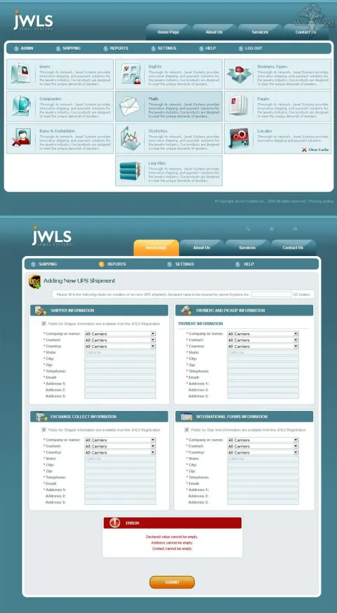
AskMeDrug - professional medical help online
Type of work: Building a medical website
Creation and layout of a medical website. A light and attractive design, everything done simply and tastefully. The site is based on the WordPress system.
AskMeDrug is a medical portal about illnesses, medicines, treatment and staying healthy, offering professional help with choosing medicines and understanding treatment. People open such a site when they or someone close to them feel unwell, when they have received a diagnosis they do not fully understand, or when they want to check a medicine before taking it. They are often anxious, and the site has to help them find reliable information quickly and read it without strain.
We created and laid out the medical website. The design is light and attractive, and everything is done simply and tastefully. A light design suits a medical portal well: it feels clean, it keeps long articles about diseases and treatment comfortable to read, and it avoids the heavy, alarming atmosphere that some medical sites create. Simplicity in the layout means that the content - articles about illnesses, descriptions of medicines, advice on treatment and prevention - remains the centre of attention, organised by topic so that a reader can move from a symptom to an illness and from an illness to its treatment.
The site is built on WordPress, which suits a content-driven portal: the editors can publish and update articles easily, organise them into categories and keep the knowledge base growing without a developer. The search phrases the portal was built for - medical help, medical consultations, health portal, choosing medicines, everything about illnesses, medical portal, everything about treating illnesses - reflect a broad audience with very practical health questions.
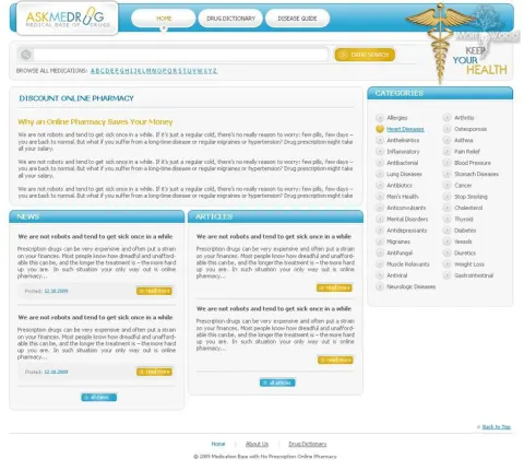
EKT - sale of fasteners
Type of work: Design of a website selling fasteners
Design for the website of the European Fastening Technologies company (EKT). The company's main line of business is the sale of various fastening materials. The client wanted the design to be based on the old one and to carry the company colours. We added an image of screws between the blocks, bringing a note of the company's field into the design.
Fasteners look like a small detail, but for the people who buy them they are critical: a construction company, a furniture factory or an assembly workshop needs nuts, screws and bolts of exactly the right size, strength class and coating, in the right quantity and on time. EKT sells such products worldwide, and its buyers are mostly professionals who order in bulk and know precisely what they need. For them a supplier's website is a tool for checking the range and placing a request, and the design has to respect that.
The client did not want to break with the past: the new design had to be based on the old one and keep the company colours that existing customers recognise. This made the project a careful evolution rather than a revolution - the familiar look became cleaner and more modern, while the company's identity stayed intact. The image of screws placed between the content blocks is a small touch that brings the company's field into the design without turning it into a catalog illustration.
The search phrases the site was built for - fasteners, buy fasteners, nuts, screws, bolts, fastening, sale of fasteners, fasteners wholesale, buy fastening materials - mix general and wholesale queries, and the design keeps both in mind: a clear presentation of product groups for those who are looking around, and an easy route to a wholesale request for those who already know what to order.
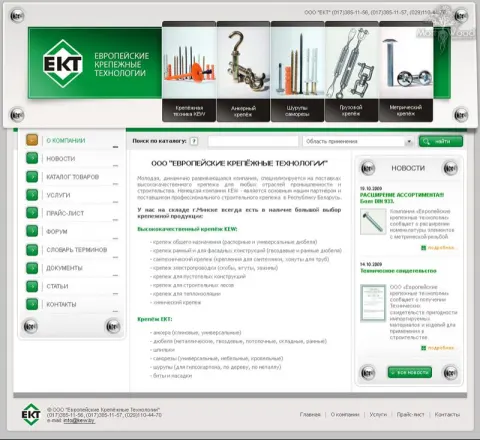
Credo Terra - innovative technologies for construction
Type of work: Creating a unique design for the Credo company
Creation and development of a unique design for the Credo company. The design used the corporate colours as well as the company logo. A forum, a request submission form and a block structure for the site were also created.
Credo Terra is a construction company that creates and brings to life innovative construction projects, from the design of a house to its construction. People who come to such a company are at the start of one of the biggest projects of their lives. They have questions about how to build a house, how a project is created and what it will cost, and they need to see that the company is competent, modern and trustworthy before they hand over their plans and their savings.
We created and developed a unique design for the company. The design uses the corporate colours and the company logo, so that the website becomes a natural continuation of Credo Terra's brand rather than a separate visual world. Beyond the visual part, the project included functional elements that support the company's work with clients. A request submission form gives a visitor a simple way to describe their idea and ask for a project, a forum creates a space where clients and the company can discuss questions about construction, and a block structure for the site organises the content into clear, reusable sections - projects, technologies, services - that the company can easily expand.
The search phrases the site was built for - construction, build a house, house project, create a project, creating a house project, how to build a house, construction company - follow the path of a future homeowner from the first question to choosing a builder. A coherent branded design combined with tools for communication helps the company accompany clients along this whole path.
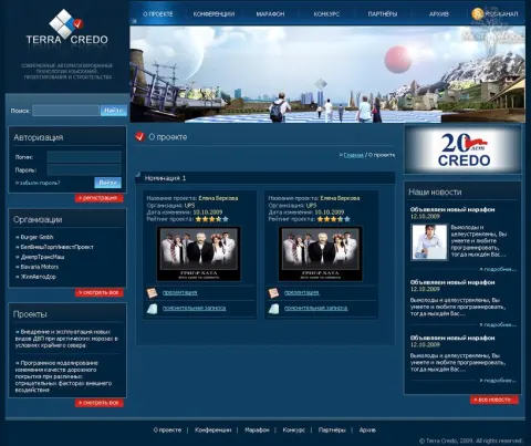
NotebooksBatteries - sale of laptop batteries
Type of work: Design of an online shop selling laptop batteries
Development and creation of a design for the ShopXML affiliate selling laptop batteries.
NotebooksBatteries is an online shop that specialises in one product: batteries for laptops from many manufacturers. A laptop battery wears out with time - after a few years it holds a charge for a fraction of its original time - and for many users replacing it is the cheapest way to give an old but otherwise working laptop a second life. The buyer usually knows the brand and model of the laptop and wants to find a compatible battery quickly and be sure it will fit.
We developed and created the design of the shop, which works as an affiliate of the ShopXML network. In an affiliate store the catalog and the product data come from a shared source, so the design is what gives the shop its own face and makes it convenient for a particular audience. A narrow specialisation is an advantage here: the whole shop can be organised around a single question - which battery fits my laptop - with navigation by manufacturer and model at the centre and product cards that make compatibility and the key characteristics of a battery, such as capacity and voltage, easy to check.
The search phrases the shop was built for - laptop battery, laptop batteries, buy a battery for a laptop, buy a laptop accumulator, laptop components - are narrow and purchase-oriented. A focused shop with a design built around compatibility answers them more directly than a general electronics store, and that is its main competitive strength.
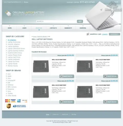
PowerfulLaptopBattery - accumulators, batteries and other laptop components
Type of work: Design for an online shop selling laptop components
Creation of a design for the ShopXML online shop on the theme of laptop components.
PowerfulLaptopBattery is another online shop of the ShopXML network, this time built around rechargeable batteries and other components and accessories for laptops. Its name puts the main promise up front: power, meaning a battery that brings a laptop back to a full working day away from the socket. Customers come to it when their laptop has started to die after an hour or two, when the old battery has swollen or stopped charging, or when they need a spare battery for long trips.
We created the design of the shop on the theme of laptop components. Since it shares the ShopXML platform and product data with other stores of the network, the design had to give it a distinct identity of its own, so that a visitor perceives it as a separate, specialised shop rather than a copy. The visual theme draws on the idea of energy and reliability, while the structure keeps batteries in the foreground and places other components - chargers, adapters and accessories - next to them as natural companions of a battery purchase. A buyer looking for a new battery often needs a charger too, and seeing it nearby saves a second search.
The search phrases the shop was designed for - laptop battery, battery for a laptop, buy a new accumulator, rechargeable battery, laptop components - are practical and specific. A clear thematic design and a catalog that groups the battery with what usually accompanies it help the shop answer them well.
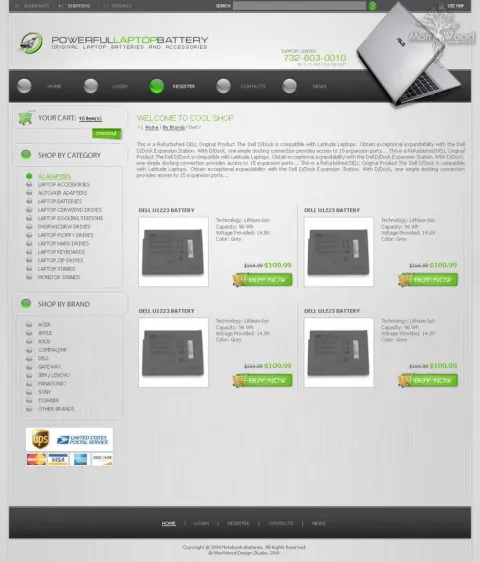
LadyToday.ru - a women's magazine about the secrets of beauty
Type of work: Portal redesign
How to lose weight without dieting, a healthy lifestyle - these are just a few of the questions you can find answers to on the LadyToday portal. We tried to capture the general theme and create an attractive style and a convenient interface on the existing template.
LadyToday.ru is a women's online magazine about the secrets of beauty and style, a healthy lifestyle, losing weight without strict diets and the psychology of relationships. Its readers come for advice they can use in everyday life - how to take care of their appearance, how to put together a stylish outfit, how to feel better and more confident - and they return regularly if the magazine is pleasant to read and easy to navigate.
The project was a redesign of the portal. We worked on the existing template rather than building a new site from scratch, and our task was to capture the general theme of the magazine and create an attractive style and a convenient interface within that framework. A redesign on an existing template is a careful job: the structure and functionality that the editors and readers rely on stay in place, while the visual layer changes enough for the magazine to look fresh, feminine and appealing. The aim was to make the many articles on fashion, beauty, health and relationships easy to discover, so that a reader who came for one piece of advice finds the next interesting topic without effort.
The search phrases the portal works with - fashion, women's magazine, beauty, losing weight without dieting, how to be beautiful, how to be happy, women's beauty, fashion and style - show how broad its audience's interests are. An attractive style and a convenient interface help the magazine hold this wide range of topics together and keep readers coming back.
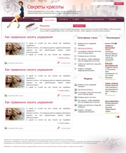
PharmLab - an online shop of pharmaceutical products
Type of work: Design, layout, CMS integration
Creation of an original and memorable design in bright and attractive tones for an online shop of pharmaceutical products. We tried to create a clickable design with convenient and fast access to the available information.
PharmLab is an online shop of pharmaceutical products, where customers can search for and buy the products they need online. Its visitors usually arrive with a specific item in mind and want to find it quickly, check the essential information and complete the purchase. At the same time a pharmaceutical store, like any shop related to health, has to make a trustworthy impression, because the customer is buying something that affects their well-being.
We developed the design, made the layout and integrated the site into a CMS. The client wanted an original and memorable design, and we made it in bright and attractive tones. This is a deliberate departure from the cold white-and-green look that many pharmacies share, and it makes PharmLab stand out and stick in the memory of a customer who compares several shops. We also aimed for a clickable design with convenient and fast access to the available information: buttons and links are clear and inviting, the categories of products are easy to reach, and every page leads naturally to the next useful step - from a category to a product, from a product to its description and from the description to the order.
The search phrases the shop works with - pharmaceuticals, pharmaceutical products, pharmaceutical products online, online pharmacy, buy products online - describe people who already intend to buy and are choosing where. A bright, memorable and convenient design gives them a reason to choose PharmLab and to come back to it next time.
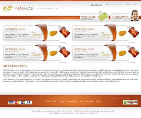
Mournin-Crimson.com - the official website of the Belarusian mystic-gothic band
Type of work: Website design
A night at full moon is the time when all the scariest stories come alive, when you walk past an abandoned graveyard and every sound makes your hair stand on end. But if you look at it from another angle, there is a hidden beauty in all of this, known as the gothic. Its own romance, its own images and feelings. It is impossible to convey the whole range of emotions in a single image; we only tried, as far as we could, to reflect the atmosphere and convey through our design the images and motifs of the band's work.
Mournin-Crimson.com is the official website of the Belarusian mystic-gothic band, so beyond atmosphere it had to do the practical work of an official band site: to be the place where fans find authentic information about the band, its music and its news, and where people who have just heard of the band can get to know it. An official site carries the band's voice, and every visual choice on it is read by fans as a statement about the band itself.
The night, the full moon and the abandoned graveyard of the band's imagery became the starting point of the design. We worked with these motifs as with a mood rather than a set of decorations: dark backgrounds, a cold moonlit palette and mystical details that create the feeling of stepping into the band's world, while the information - about the band, its releases and its activities - remains readable and easy to find. The challenge was to show the romance and hidden beauty of the gothic, not only its fear, because that duality is at the heart of the band's work.
The search phrases the site was built for - Mournin Crimson, Belarusian band, music band, gothic, mysticism, mystic-gothic band - include both the band's name and the genre. The design serves both kinds of visitors: devoted fans who search for the band directly and listeners of gothic and mystical music who discover it through the genre.
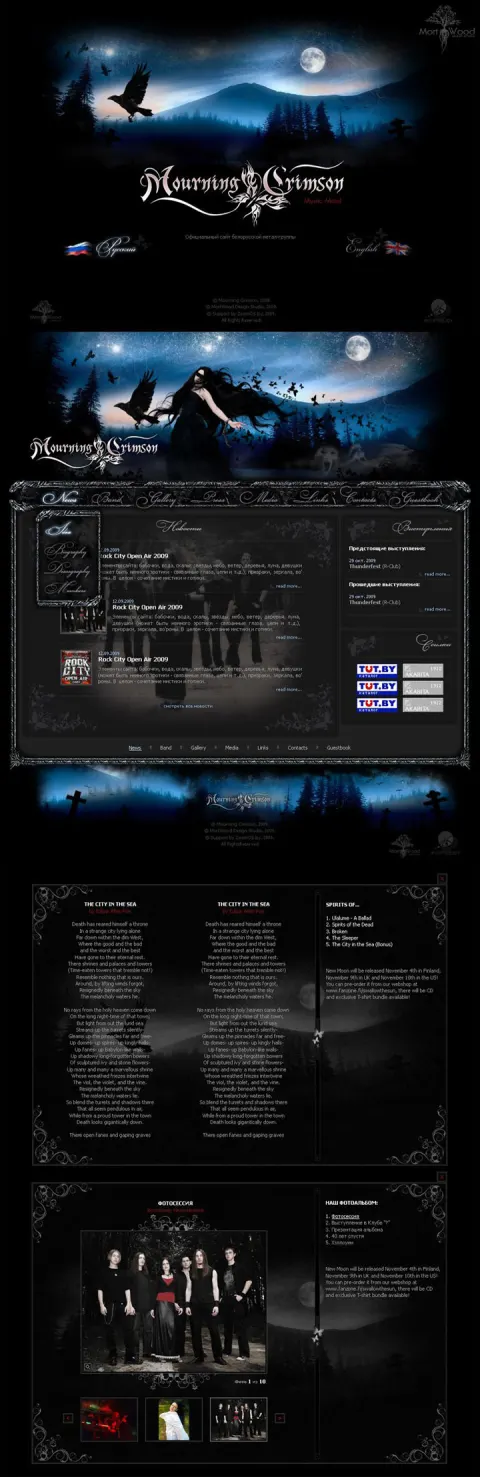
PerfecToyStore.com - original, interesting and fun toys for children
Type of work: Design, layout, CMS integration
Everyone remembers the excitement with which they walked into a toy shop as a child. Those were unforgettable moments. It felt as if you were entering a fairy tale - you wanted to touch everything. We tried to embody the vividness of a child's perception of the world in the design of this toy shop.
PerfecToyStore.com is an online shop of original, interesting and fun toys for children. A toy shop has an unusual double audience: the toys are for children, but the purchase is made by adults - parents, grandparents, aunts and uncles looking for a gift. The design therefore has to speak to the child's sense of wonder and, at the same time, make it easy for a busy adult to choose a suitable toy by age, gender or interest and order it quickly.
Our idea for the design came from that childhood memory of walking into a toy shop and feeling as if you were entering a fairy tale. We tried to embody the vividness of a child's perception of the world: bright colours, playful shapes and a cheerful atmosphere that makes the site feel like a magical place rather than a catalog. Behind this lively surface the structure stays practical for adults. The categories follow the questions gift-givers ask - toys for the little ones, toys for girls, toys for boys - so that someone who knows only the age and interests of the child can still find something suitable in a few clicks. We developed the design, made the layout and integrated the shop into a CMS, so that the owners can add new toys and seasonal collections themselves.
The search phrases the shop was built for - toys, toys online, online toy shop, buy a toy, toys for children, toys for little ones, toys for girls, toys for boys - reflect exactly this mix of a joyful product and a practical search.
VirtCasino.com - convenient reviews and ratings of online casinos
Type of work: Design, layout
What comes to mind when you hear the word "casino" - chips, dice, cards, roulette, green baize. We tried to reflect all these associations in the design of a portal devoted to reviews of online games. Systematisation and clarity of the various blocks and statistics tables, of the data presented, a convenient interface - this and much more is what we believe we successfully solved in this project.
VirtCasino.com is a portal of reviews and ratings of online casinos and casino games. Its visitors want to compare platforms before they play: which casinos are reliable, what games they offer, how they pay out and how other players rate them. Such a portal lives by data - ratings, statistics and comparison tables - and its value depends on how easy it is to read and compare that information.
We started from the associations the word "casino" brings to mind - chips, dice, cards, roulette and green baize - and reflected them in the design of the portal. These motifs give the site an instantly recognisable atmosphere and set the mood for the subject. But atmosphere was only half of the task. The other half, and the harder one, was the systematisation and clarity of the many content blocks and statistics tables: reviews, ratings and data had to be presented in a clear, consistent structure, so that a visitor can scan a table, compare several casinos side by side and quickly find the facts that matter to them. We believe we solved this successfully - the interface combines the familiar casino atmosphere with an orderly presentation of information. Our work covered the design and the layout.
The search phrases the portal was built for - online games, online casino, casino online, online game reviews, online casino reviews, online casino ratings - describe visitors who are researching before they decide, and a clear, data-friendly interface is exactly what such research needs.
USA-Piercing.com - the best piercing jewellery!
Type of work: Design, layout, CMS integration
In this project we tried to use the knowledge and experience gathered earlier. The reworked page code and site structure compared with the basic version will play into our hands when promoting the site. A clickable interface and a pleasant appearance will not leave visitors indifferent; the site will be memorable and recognisable.
USA-Piercing.com is an online shop with a wide range of piercing jewellery - rings, earrings, barbells and studs. By the time we took on this project we had already designed several stores in the same niche, and we made a point of using the knowledge and experience gathered on them. That experience showed what matters most in a piercing shop: buyers choose by the place of the piercing and the type of jewellery, they want to see pieces clearly and they come back when the shop is easy to recognise and pleasant to browse.
The main improvement over the basic version lay beneath the surface. We reworked the page code and the structure of the site, making them cleaner and more logical. Visitors may not notice this directly, but it plays an important role in promotion: search engines understand a well-structured site better and rank it more readily, which matters for a shop that competes with many others for the same piercing-related queries. On the surface, we aimed for a clickable interface and a pleasant appearance - inviting buttons, a clear path from category to product and a look that makes the site memorable and recognisable among similar stores. We developed the design, made the layout and integrated the shop into a CMS.
The search phrases the shop was built for - piercing, piercing jewellery, buy interesting piercing jewellery, rings, barbells, studs, earrings - are highly competitive, and the combination of a clean technical structure with a recognisable design is what gives the shop a chance among its rivals.
UpMedis.com - an online shop of pharmaceutical products
Type of work: Design, layout, CMS integration
Development of an attractive and memorable design for an online pharmacy. No shouting banners, elegance and style in the presentation of information.
UpMedis.com is an online pharmacy for convenient search and purchase of pharmaceutical products. Customers of an online pharmacy have little patience for anything that stands between them and the medicine they need: they want to type a name, find the product, check the information about it and place an order. They also judge the shop by how serious it looks, because a pharmacy that resembles a flashy discount store raises doubts about the quality of what it sells.
Our goal was an attractive and memorable design for the pharmacy, and the principle we followed fits in one sentence: no shouting banners, elegance and style in the presentation of information. Many online pharmacies try to catch attention with aggressive promotions, flashing offers and crowded pages. UpMedis takes the opposite route - a calm, refined design in which information about products is presented clearly and with dignity. This approach makes the shop easier to use, because the visitor is not distracted from the search, and it makes it more trustworthy, because restraint signals professionalism. The memorable part comes from the elegance of the style rather than from noise. We developed the design, made the layout and integrated the shop into a CMS.
The search phrases the pharmacy was built for - pharmaceutical products, online pharmacy, medicines online, pharmaceutical products online, drug search, ordering medicines - describe customers with a clear purpose. A design that respects that purpose and gets out of its way is the best service an online pharmacy can offer.
Guess.by - stylish clothing with a world-famous name
Type of work: Website design
Stylish clothing - a stylish website! Our task was to create a design combining style, glamour, modernism and grunge; to highlight and play up the main line - denim clothing. The dark background (the client's requirement), conciseness and splashes of bright red alongside the roughness of the background create the required mix of styles.
Guess.by is an online shop of clothing from the world-famous Guess brand, best known for its denim. Fans of a famous brand come to its shop with a clear idea of its style and expect the website to match it: a site that looked ordinary or old-fashioned would undermine the very image that makes people want the clothes. Our motto for the project was simple - stylish clothing deserves a stylish website.
The task was to create a design that combines style, glamour, modernism and grunge, and to highlight and play up the brand's main line - denim clothing. These are not obvious companions: glamour is polished and shiny, grunge is rough and rebellious, and modernism prefers clean lines. We brought them together through a few deliberate choices. The dark background was the client's requirement, and we gave it a rough, textured feel that recalls worn denim and the grunge aesthetic. Against it we placed concise, modern layout and typography and splashes of bright red - the accent colour that adds glamour and energy and draws the eye to the most important elements. Together, the roughness of the background, the conciseness of the layout and the red accents create the mix of styles the brief asked for, and the denim collection naturally stands at the centre of this composition.
The search phrases the shop was built for - clothing, buy clothing, fashionable clothing, stylish clothing, Guess online clothing shop, clothing at good prices - show an audience that wants both the brand's style and a convenient place to buy it.
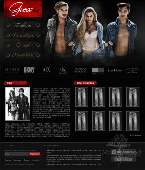
KupiDveri.by - metal entrance doors and interior doors
Type of work: Design, layout, programming, CMS, SEO
Metal entrance doors and interior doors. Complete creation of the website. When creating the design, above all we did not want to make the site bulky. We wanted the site to be bright and not to feel cluttered or closed in. At the same time it was necessary to provide convenient navigation and search for the required information.
KupiDveri.by sells metal entrance doors, interior doors and quality door hardware. Doors are a purchase that combines practical and aesthetic concerns. An entrance door is chosen above all for security and insulation, an interior door for how it fits the style of the home, and in both cases the buyer also needs the right hardware - locks, handles and hinges. Most buyers are in the middle of moving or renovating, juggling many decisions at once, and they appreciate a shop where they can find what they need without effort.
For this project we did the complete creation of the website: design, layout, programming, integration into a CMS and search engine optimisation. When creating the design, our first principle was not to make the site bulky. Door catalogs often turn into heavy pages full of large images and dense blocks, and we wanted the opposite - a bright site that does not feel cluttered or closed in, with plenty of air around the products. At the same time a light design could not come at the cost of usability, so we paid special attention to convenient navigation and search: entrance doors, interior doors and hardware are clearly separated, and the visitor can quickly narrow the choice to what suits them.
Because SEO was part of the job from the start, the structure of the site was built around the search phrases buyers use - doors, entrance doors, interior doors, door hardware, buy doors, doors at good prices, door shop, hardware for doors - so that each of these queries leads to a relevant, well-organised page.
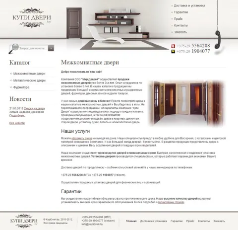
The most topical events from the world of music, culture, art and cinema on Zaycev
Type of work: Layout, programming
A fairly large and extensive project that really made us "sweat". Excellent working experience for us and, as a result of this work, a useful and functional resource. We brought the client's idea to life and made all the cogs of this mechanism turn as a single whole.
This project is a city events listing for Zaycev - a guide to the most topical events in music, culture, art and cinema. A listing answers one of the most common questions people ask at the end of the week: where to go at the weekend? Cinema premieres, parties, exhibitions, concerts, theatre performances, museums and clubs all compete for attention, and the listing has to bring them together in one place, keep them up to date and let a visitor quickly find something that matches their mood, their plans and their date.
Our part of the work was the layout and the programming, and it was a fairly large and extensive project that really made us sweat. A listing is a complex mechanism: events belong to different categories, venues and dates, they appear and expire constantly, and every page has to show the right selection at the right time. The challenge was to bring the client's idea to life and make all the cogs of this mechanism turn as a single whole - categories, schedules, venue information and event pages working together so that the visitor sees a coherent, current picture of the city's cultural life. It was excellent working experience for us, and the result is a useful and functional resource.
The search phrases the listing was built for - listings, online listings, where to go at the weekend, cinema, theatre, concerts, exhibitions, museums, clubs and parties - cover the whole range of city leisure, and the programming behind the site makes sure that each of these interests leads to a page with real, up-to-date events.
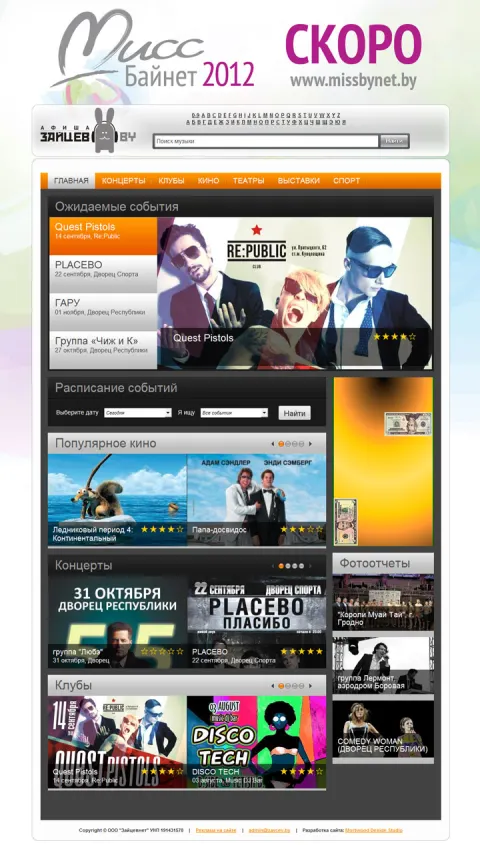
V Dorogu - a free service for building travel packing lists
Website: https://v-dorogu.com
Type of work: Design development, layout, web service development
Development of a unique design and of a web service that answers one question - what to take with you on the road. The visitor sets the purpose and length of the trip, who is travelling, how they are getting there, where they will stay and what weather to expect, and receives a ready packing list.
The list can be edited, saved as a PDF or printed, so nothing is forgotten while packing. Alongside the generator the site carries a library of travel articles - where to go, what money to take, how to save and how to avoid trouble on the way.
The whole home page is built around one filter with six short questions: what is the purpose of the trip, how long it lasts, who is going, how they will travel, where they will stay and what weather is expected. These are exactly the factors that change a packing list - a business trip by train needs different things from a family beach holiday or a hike with a tent - so the visitor answers them in a few clicks and immediately gets a list that fits their situation rather than a generic checklist.
The service is free, and the result is meant to be practical: the list can be edited to add personal items, saved as a PDF or printed and ticked off while packing. The articles below the generator extend the same idea from things to decisions - where it is better to rest, which money to take, how to save and how to avoid unpleasant situations on the road - so that the site helps before the trip as a whole, not only on the evening of packing.
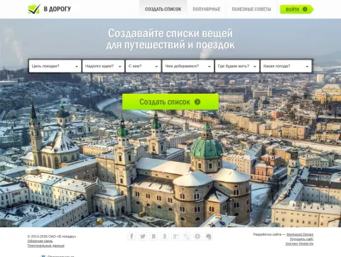
Sales Laboratory - sales courses, CRM implementation and automation
Website: https://saleslabs.eu
Type of work: Design development, layout, CMS integration
Website development, creation of a unique design and integration into the CMS for Sales Laboratory, a team that trains sales people and builds sales systems on top of CRM.
The site holds two lines of business at once: a practical sales course with 80% practice, a programme description and online purchase, and CRM services - implementation of Bitrix24 and AmoCRM, messengers through Wazzup, SIPSIM telephony, accounting in MoySklad and sites on Tilda. It also carries partner pages, cases, a blog and contacts, and works in Russian and English.
The course is presented as a clear programme rather than a promise: ten modules over one month, 49 videos and more than 160 quiz questions, with a personal access link so that students can learn at their own pace. Each module names the authors whose ideas it builds on - Rackham's SPIN questions, Cialdini's principles of influence, Voss's tactical empathy, the Challenger Sale - so a sales manager can see at once that the material is grounded in the classic literature, and the lesson preview with its video, diagram and quiz shows what a single lesson looks like.
The CRM part of the site speaks to a different reader, the business owner. It presents the company as an official partner of Bitrix24, AmoCRM and MoySklad, gives the numbers - more than nine years of practice and over thirty projects - and describes each connected service in one line, ending with a request for a cost estimate.
Sadovka.by - online store of garden machinery and power tools in Minsk
Website: https://sadovka.by
Type of work: Design development, layout, CMS integration
Website development, creation of a unique design and integration into the CMS for Sadovka.by, an online store of garden machinery and power tools with a shop on ul. Zapadnaya in Minsk.
The catalogue holds more than 10,000 items across a dozen sections - garden machinery and tools, construction equipment, power tools, pneumatic and hydraulic equipment, welding, cleaning machines, heaters and dehumidifiers, car goods - from Karcher, MTD, Stiga, Bosch, Makita and Robomow. The site also covers promotions, a manufacturers directory, payment options including instalments, free delivery in Minsk and warranty service.
With more than 10,000 items, the first thing the home page does is give the visitor a way into the range: the full list of categories sits right under the slider with the best offers, from garden machinery and tools to welding equipment, cleaning machines, heaters and car goods. A short text below explains who the shop is for - private gardeners as well as companies - and lists the payment options a buyer usually wants to know about before ordering: cash and bank transfer, cards, online payment and instalments.
The text also stresses that the shop is an official dealer of many well-known brands, so the equipment is certified and comes with the manufacturer's warranty and technical documentation, and that the staff are specialists who use garden machinery and power tools themselves and can help with the choice. A separate manufacturers directory lets a visitor who trusts a particular brand go straight to its range.
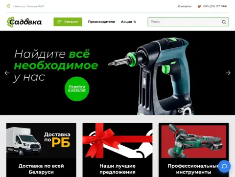
FAW Trucks - website of the official FAW truck dealer in Belarus
Website: https://fawtrucks.by
Type of work: Design development, layout, CMS integration
Website development, creation of a unique design and integration into the CMS for the official FAW Trucks dealer in Belarus, based on ul. Inzhenernaya in Minsk.
The site carries the full FAW model range - tippers, tractor units, chassis and special vehicles - both in stock and to order in any modification, with the engineering arguments for the brand, a service and spare parts section, leasing and instalment terms, vehicle registration help, company news and vacancies.
Buyers of trucks are businesses - construction companies, carriers, municipal services - and for them a vehicle is a working asset that must pay for itself. They compare not only the price but the cost of ownership: fuel, maintenance, the availability of spare parts and how quickly a broken truck can be put back on the road. That is why the structure of the site places the service and spare parts section and the financing terms next to the model range rather than hiding them at the end, and why the engineering arguments for the brand are given their own space.
The catalogue is divided by the type of vehicle - tippers, tractor units, chassis and special vehicles - because a buyer usually knows which type the job requires and then compares configurations within it. Help with registration and the news and vacancies sections complete the picture of a dealer that accompanies the client after the sale, which matters when a company is choosing a partner for a fleet rather than a single purchase.
MotoDrive.BY - online store of ATVs, motorcycles and electric bikes
Website: https://motodrive.by
Type of work: Storefront design, catalogue setup
Design of the storefront and setup of the catalogue for MotoDrive.BY, an online store of motorcycle equipment run by Energy Retail in Minsk.
The catalogue is split into more than twenty groups - motorcycles, scooters and mopeds, ATVs and electric ATVs, pit bikes and mini bikes, electric bikes and electric scooters, snow tow vehicles, mini tractors and two-wheel tractors, garden machinery, riding gear, oils, accessories and spare parts by model.
MotoDrive.BY runs on the Deal.by marketplace platform, so the project was about making the most of a ready-made storefront rather than designing a site from scratch. On such a platform the layout is largely fixed, and what decides whether a store is convenient is the design of the storefront elements and, above all, how the catalogue is organised.
The range is unusually broad for one store - from motorcycles, buggies and snow tow vehicles to electric bikes, garden machinery and engine oil - so the groups were set up the way a buyer looks for things: by type of vehicle first, then gear, liquids and accessories, and separately spare parts sorted by model, which saves an owner from searching the whole catalogue for one part. The store's working hours, every day from 9:00 to 21:00, the phone number and the customer reviews are kept visible, because on a marketplace these are what convince a visitor to order from this particular seller.
The header of the storefront describes the shop in one line - a store selling ATVs, motorcycles and electric bikes - so that a visitor arriving from the marketplace understands its focus immediately.
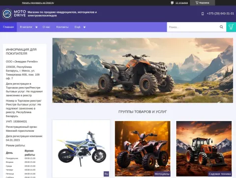
QMCTrader - ATVs, motorcycles, electric transport and spare parts in Belarus
Website: https://qmctrader.by
Type of work: Design development, layout, CMS integration
Website development, creation of a unique design and integration into the CMS for QMCTrader, a motorcycle equipment store run by Energy Retail in Minsk.
The catalogue covers ATVs and kids ATVs, enduro, motocross and road motorcycles, pit bikes, electric transport and more than 615 spare parts in stock, from STELS, CFMOTO, HISUN, KAZUMA, ODES, LINHAI, VOGE, BSE, MOTOLAND, IRBIS, WELS and SAGITTARIUS. The site also states the terms customers ask about first - DPD delivery in one to three days, 0% instalments, a warranty of up to 24 months - and adds service and repair pages and news.
The design has a technical, almost engineering character: sections are numbered, key figures stand out in large type - engines up to 200 cc, delivery in one to three days, more than 615 spare parts in stock - and the brand names run in a single row, so that a visitor sees the scale of the range within seconds. Bestsellers and the in-stock showcase follow, where machines and small spare parts such as brake pads stand side by side with their prices.
The catalogue of sections then opens up the whole range with item counts: adult and children's ATVs, motorcycles, mopeds, scooters, electric transport, snow vehicles, buggies, boats and boat motors, electric cars, two-wheel tractors, accessories and riding gear. The company works around the clock, which is stated next to the phone number, and a question form at the end offers to explain the products and delivery options and to prepare an individual offer.
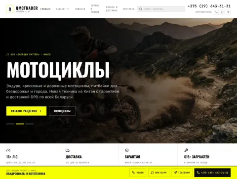
Parcel.by - delivery of goods from the USA and Europe to Belarus
Website: https://parcel.by
Type of work: Design development, layout, CMS integration
Website development, creation of a unique design and integration into the CMS for Parcel.by, an intermediary that delivers goods from the USA and Europe to Belarus.
The site holds the whole flow: a catalogue of foreign stores by category, ordering by a product link, a quick request form, a delivery cost calculator, mail forwarding, tariffs and personal accounts. Alongside them are articles, promotions, an FAQ and a customer forum.
The home page answers the main doubt of anyone who has never ordered from abroad - will it really arrive, and will it be cheaper? - with reviews from real customers in Minsk, Grodno and Brest. Each review names a city and a tracking number and describes a concrete purchase: a bicycle light and a razor bought on eBay for half the Minsk price, jeans, trainers and a phone from the USA with the total cost of delivery, a synthesizer that arrived intact.
For people who already know what they want, the fastest routes are always in view: a quick request form, ordering by a link to the product, a call-back request and the delivery cost calculator. For those who are still looking, the store catalogue is grouped by category - electronics, clothing and shoes, goods for young mothers, car parts, home and garden and many more - and by region: the USA, the EU, the United Kingdom and Poland. The working hours, every day from 10:00 to 22:00, are stated in the header.
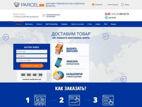
PurpleLabs web studio: websites, bots and business automation
PurpleLabs is a web development studio with more than 20 years of experience. We run the whole project: we study the task, build a prototype, draw a unique design, code the layout, program the logic and launch the site on the server. That is how business-card sites, online stores, corporate portals, landing pages and web applications appear for retail, fintech and IT companies across Europe and beyond.
Besides websites we build automated bots and our own software products: chat bots for the site, Telegram, WhatsApp and social networks, booking and appointment bots, automatic article posting, a CRM and a content management system, warehouse stock accounting, mail campaigns, backups and protection against hacking. It all works together: the site brings in a customer, the bot answers and books the visit, the CRM carries the deal through to payment.
After launch a project is not left alone. We update content, watch loading speed and security, take care of SEO promotion and add features as the business grows. The timeline of works collects the projects we designed, drew and launched — from small sites to services with a user account and online payments. Tell us about your task and we will propose a solution, a schedule and a price.